Brand build/Raina
Building A Jerky Brand Beyond The Expected.
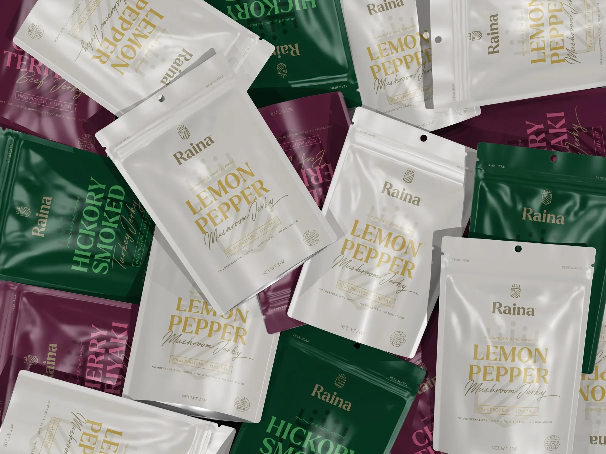
Raina was developed as a CPG startup around high-quality beef, turkey and mushroom jerky in bold flavor combinations. We created the identity, packaging architecture and style system that made three product families feel unmistakably related while keeping every protein and flavor easy to find.
- Client
- Raina
- Restaurant context
- CPG startup / Beef, turkey and mushroom jerky / Three product families / Twelve shown flavors
- Role
- Brand concept, identity, packaging architecture, SKU differentiation and style guide
- Solutions
- Marketing
- Engagement
- Brand build and packaging
- Primary outcome
- More Visible / Consistent
The brand
A Familiar Snack With A Broader Point Of View.
Raina was conceived as a CPG startup built around high-quality jerky and adventurous flavor combinations. The assortment stretched across beef, turkey and mushroom, giving the brand more variety than a conventional single-protein line.
Each product still needed to work as a quick snack decision. Shoppers had to understand the protein, flavor, benefit cues and brand relationship within seconds—whether they encountered one pouch or the full assortment.
What was happening
Twelve Flavors Could Easily Become Twelve Separate Products.
Three protein types created an immediate architecture problem. If every pouch looked too similar, shoppers could miss the difference between beef, turkey and mushroom. If every flavor behaved independently, the startup would lose the recognition a new brand needs most.
The packaging also had to hold several messages at once: flavor, product type, benefit statements, ingredient-related claims, resealability and weight. The system needed hierarchy before it needed decoration.
What we saw
Protein Could Organize The Family. Flavor Could Bring The Energy.
Raina could use a strong base color to identify each product family, then let brighter accents distinguish individual flavors. That gave shoppers two levels of navigation: first the kind of jerky, then the taste.
A crest-like monogram and confident serif wordmark added authority, while expressive flavor typography and script product names kept the brand from feeling clinical. A subtle vertical pattern tied the system together without overwhelming the food story.
What we changed
One Brand System Across Three Product Families.
01 / Brand concept and identity
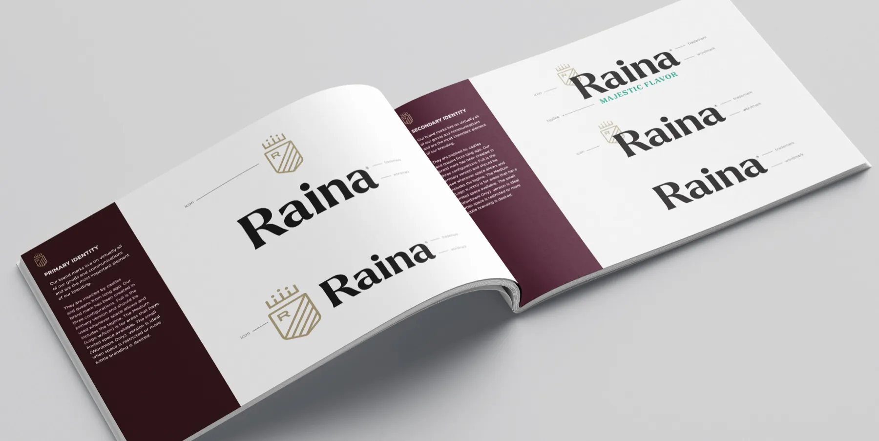
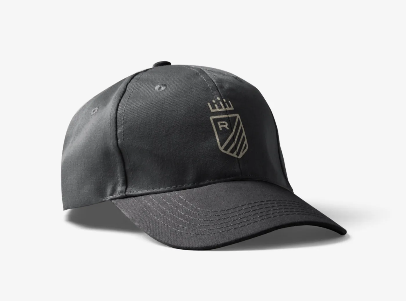
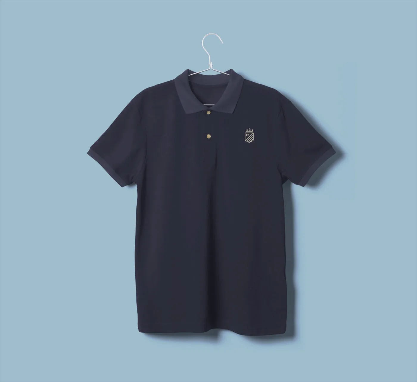
We paired a crowned R shield with a direct Raina wordmark, creating a compact mark for small applications and a stronger nameplate for the front of the pouch.

02 / Product-family architecture
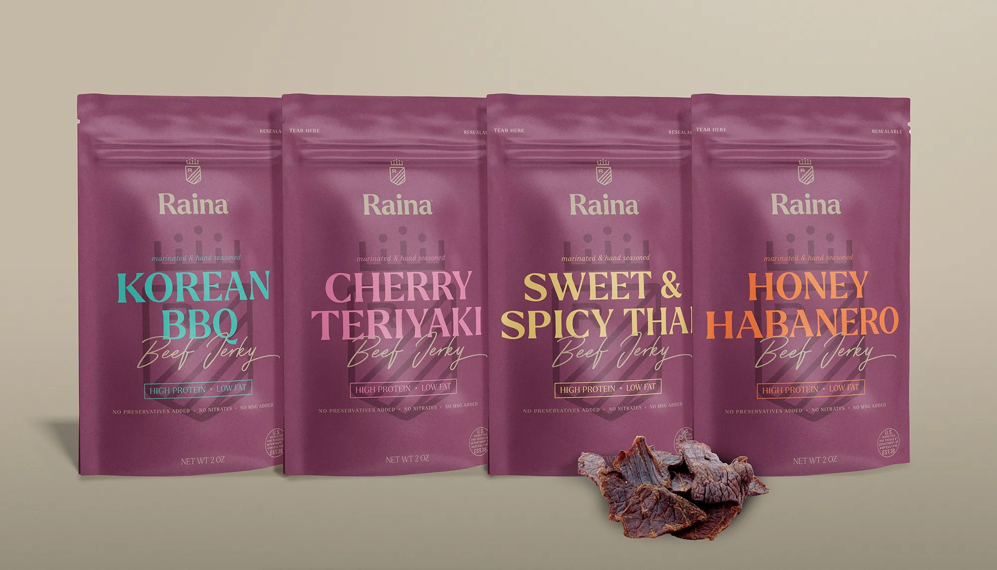
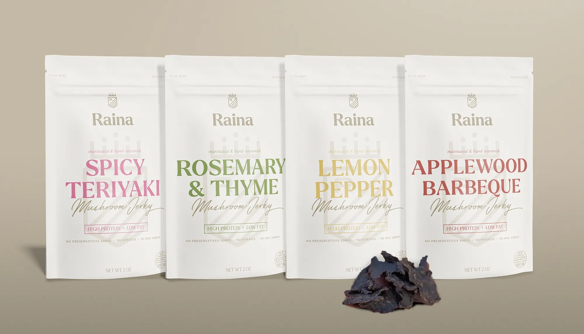
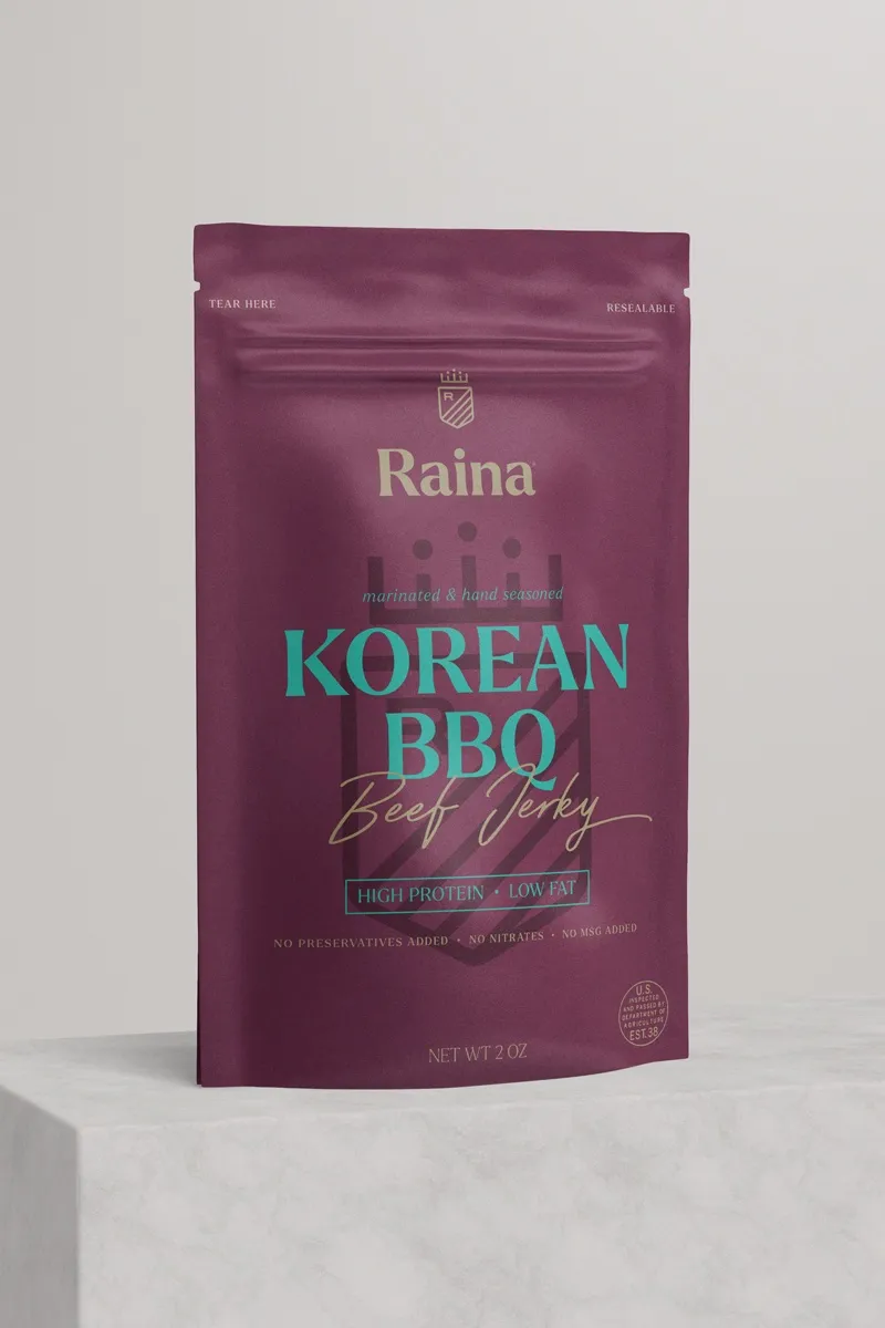
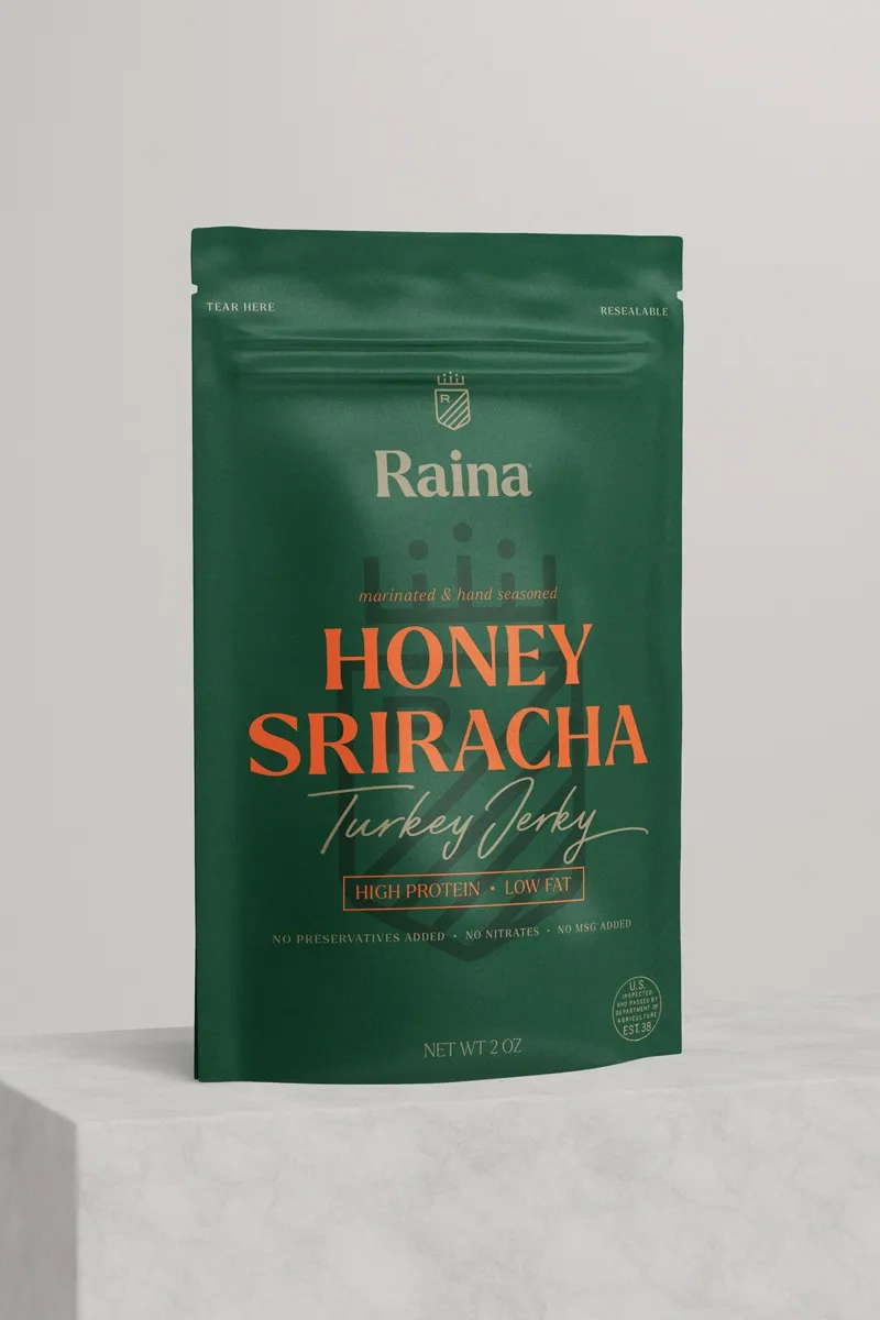
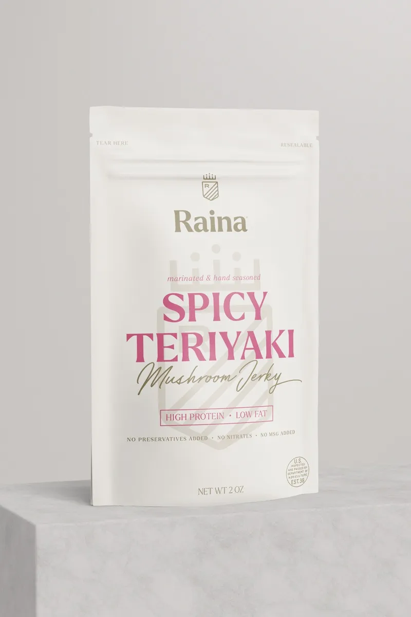
Deep plum identified beef, green identified turkey and cream identified mushroom. Consistent placement for the brand, flavor, product type and benefit statements kept the line coherent.
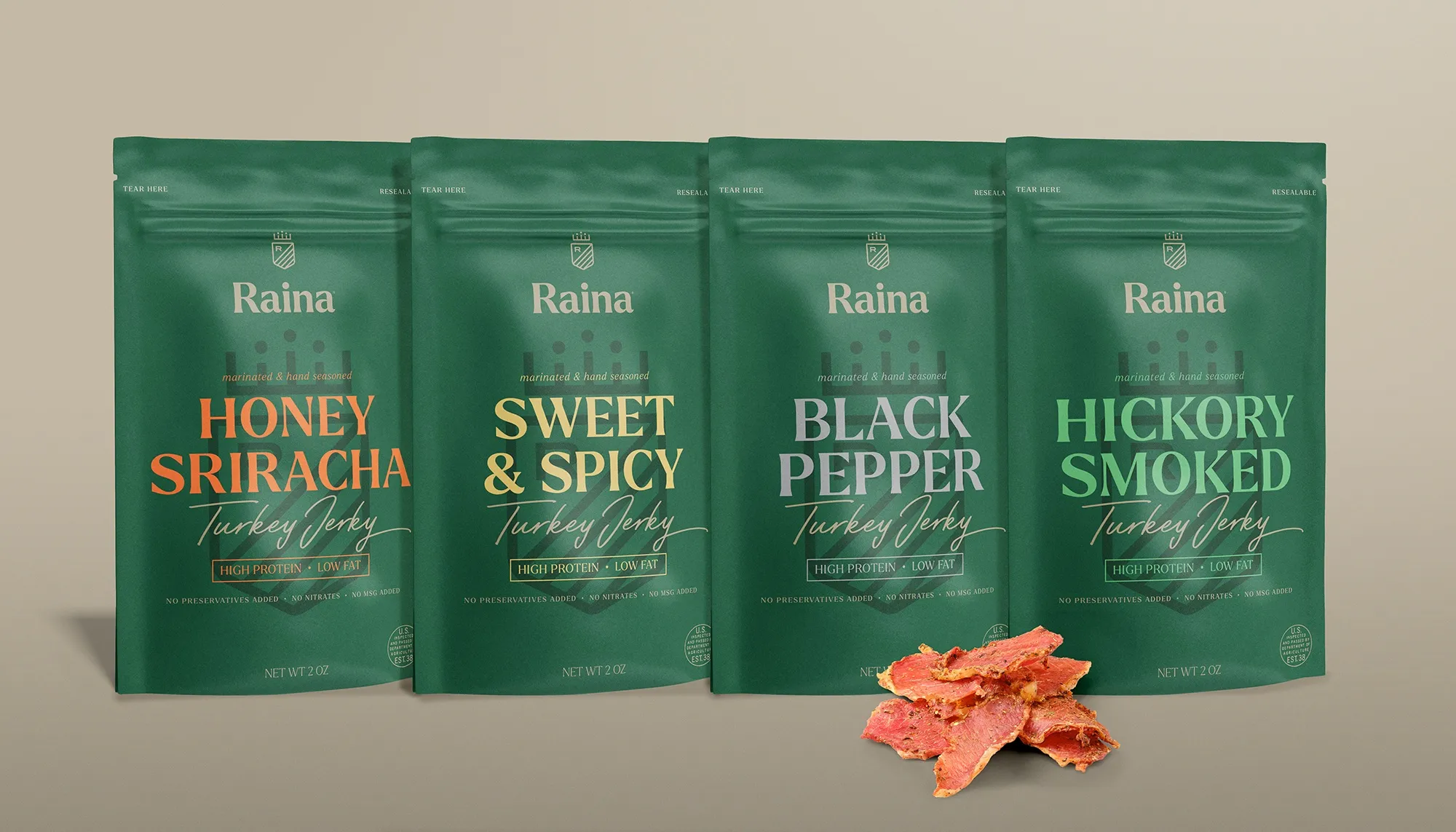
03 / Flavor-level differentiation
Large flavor names and bright accents gave each recipe a distinct voice without changing the core structure. The system supported four shown flavors in each product family.
04 / Brand standards and applications
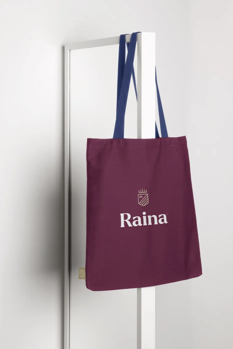
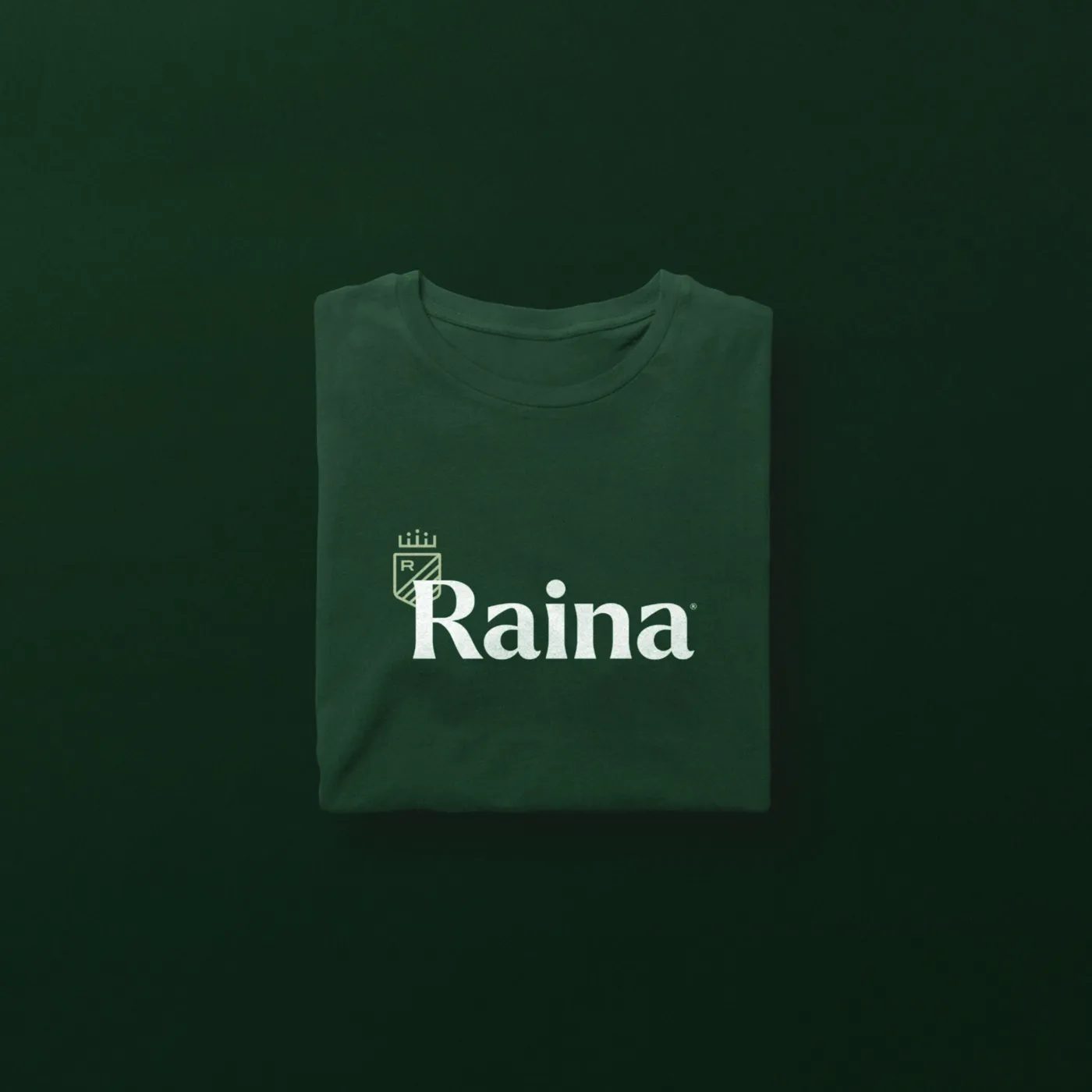
A style guide documented the identity and its use, while apparel and tote applications demonstrated how the brand could extend beyond the pouch without losing recognition.
One from each family
Beyond the pouch
How the pieces connected
The System Made A Large Assortment Feel Simple.
- Brand idea
- →Product family
- →Base color
- →Flavor accent
- →Information hierarchy
- →Shelf recognition
The identity established recognition. Base colors organized the protein families. Accent colors and large flavor names made each recipe distinct. Repeated product and benefit cues closed the decision. Together, the system made twelve pouches easier to scan without making them feel repetitive.
The impact
A Startup Brand Ready To Show Its Range.
The finished concept gave Raina a recognizable CPG platform across beef, turkey and mushroom jerky. The assortment could appear as three distinct families or one coordinated line without changing how the brand was read.
Portfolio clarity
Three families, one brand
Base colors separated beef, turkey and mushroom while the shared identity kept them visibly connected.
Choice clarity
Twelve distinct flavors
Large names and flavor-specific accents made individual recipes easier to identify across the assortment.
Shelf recognition
A consistent retail face
Repeated pouch structure, typography and product cues created a recognizable block when the products appeared together.
System flexibility
Room to extend
The architecture could support additional flavors and brand applications without redesigning the system from the beginning.
The outcome is visible in the system itself: Raina could introduce variety without sacrificing recognition, giving a new brand the structure it needed before entering a crowded category.
Explore More Impact Stories
Build a more profitable restaurant.
Build The System Before Building The Assortment.
When a food brand launches with multiple products, every package has to work alone and together. A clear architecture helps customers choose faster, protects recognition across the line and gives the business room to add new products without starting over.
Let’s Talk Growth