Brand build/Essential Juicery
A Fresh Brand Built To Grow.
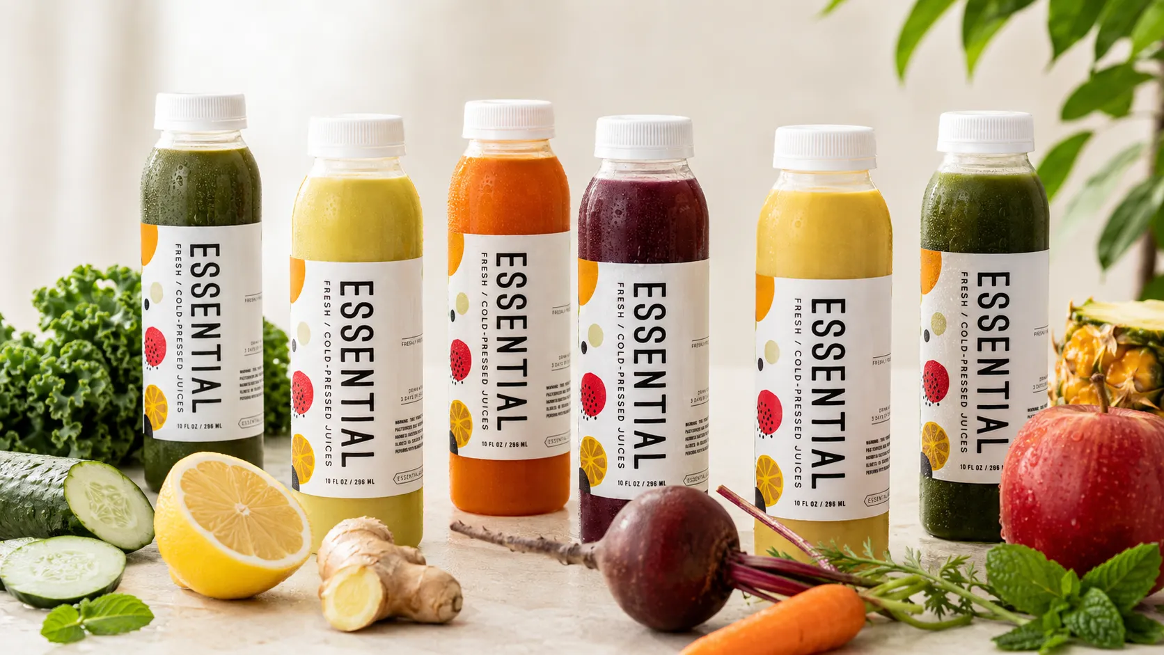
Essential Juicery had a premium product and an uncommon opportunity: a storefront steps from Mayo Clinic with a broad, international audience moving past its doors. We built the name, identity, packaging, digital presence and in-store experience that made cold-pressed juice feel flavorful, approachable and unmistakably its own.
- Client
- Essential Juicery
- Restaurant context
- New independent concept / Rochester, Minnesota
- Role
- Naming, positioning, brand identity, packaging, responsive website, interior, signage and launch marketing
- Solutions
- Marketing / Expansion
- Engagement
- Brand build and launch
- Primary outcome
- More Visible / Scalable / Valuable
The restaurant
A Serious Product In A Place With Global Reach.
Essential Juicery was a new independent juice shop in Rochester, Minnesota, built around fruit and vegetable juices cold-pressed fresh each day. Its location near Mayo Clinic put the concept in front of local residents, clinic employees, patients and visitors from around the world.
The product was serious about nutrition, but the business could not afford to feel clinical. It needed a brand that could earn trust quickly, make unfamiliar flavor combinations feel inviting and turn a health-led product into something people genuinely wanted to taste.
What was happening
The Product Was Premium. The Story Was Complicated.
Cold-pressed juice can become complicated fast. Multiple ingredients, nutritional language and wellness claims can crowd the story before appetite ever enters the picture. Essential also needed to stand out in a busy, high-traffic environment while remaining inclusive and easy to understand for a broad audience.
The challenge was larger than creating a logo. Naming, packaging, storefront, menu, website and launch marketing all had to tell one clear story: this was a premium product, but it was also bright, friendly and full of flavor.
What we saw
Flavor Had To Lead. Health Had To Be Felt.
The opportunity was to make the brand feel as fresh as the product—not by showing more information, but by creating a simpler system for expressing it.
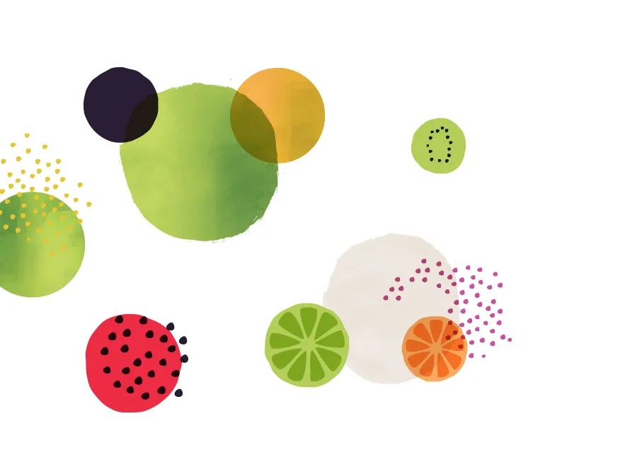
A memorable naming system, energetic color and custom ingredient illustrations could make each juice distinct while helping the full product line read as one family. The same visual language could then travel from a bottle label to a menu board, storefront, website or campaign without losing its identity.
What we changed
One Brand System, From Bottle To Storefront.
01 / Positioning and naming
Working directly with the owner, we helped establish the Essential Juicery name and a set of distinctive names for five signature juices. The language focused on approachability and flavor, giving customers an easier way to remember, talk about and order the products.
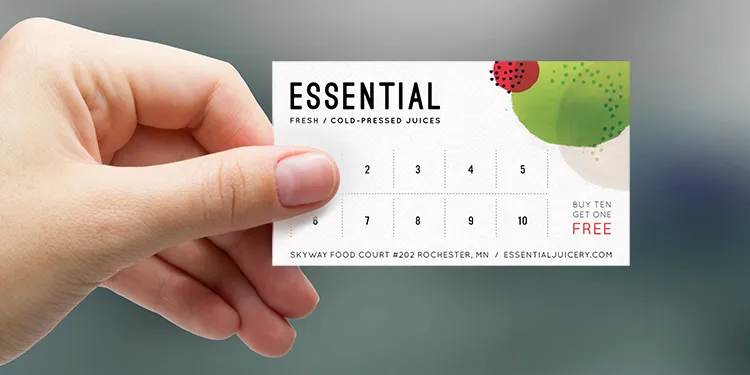
02 / Identity and packaging
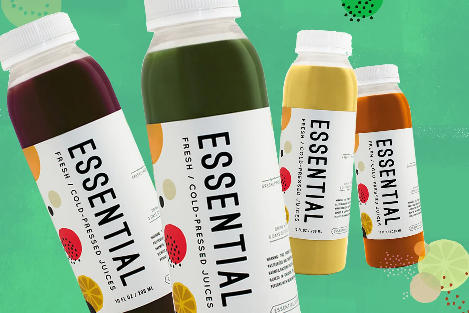
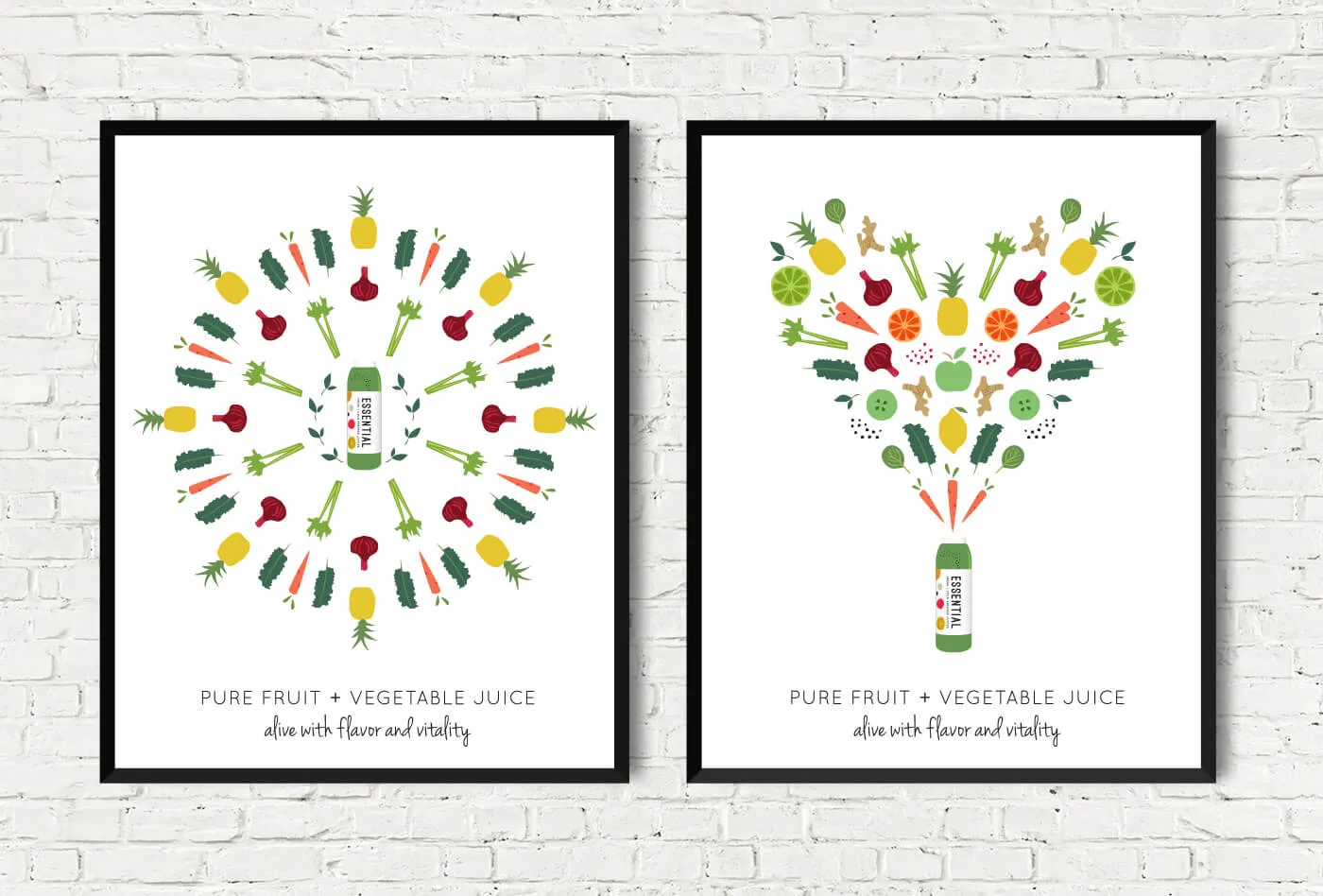
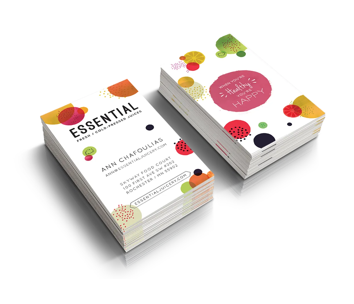
We created a bright color palette, clear typography and a flexible identity system built to feel both playful and premium. Custom illustrations represented the ingredients in place of photography, allowing every bottle to communicate what was inside while keeping the product family visually clean and cohesive.
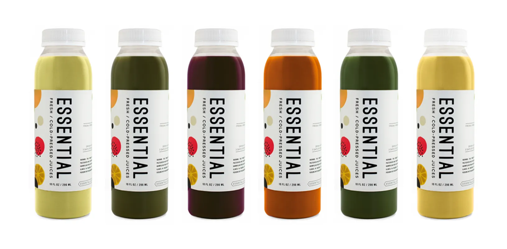
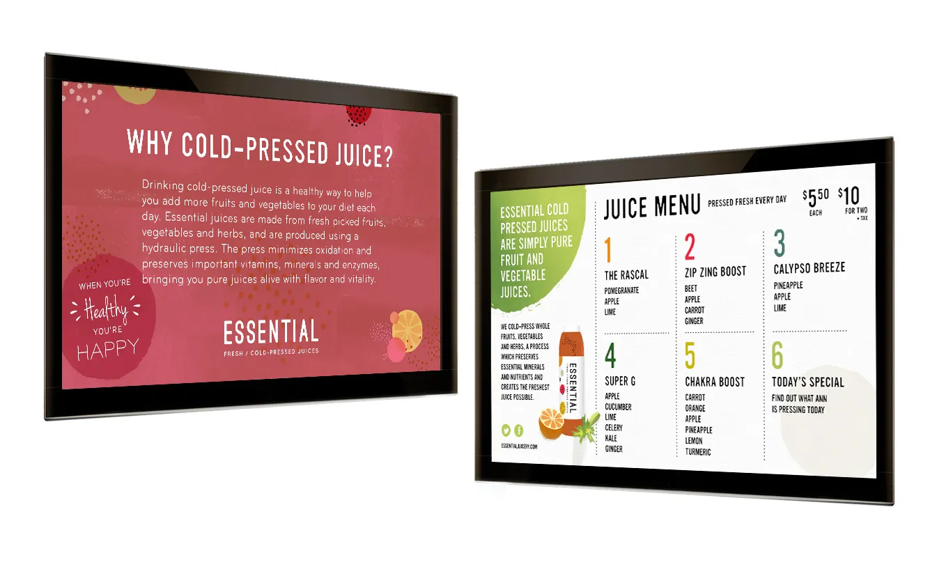
03 / Retail and digital experience
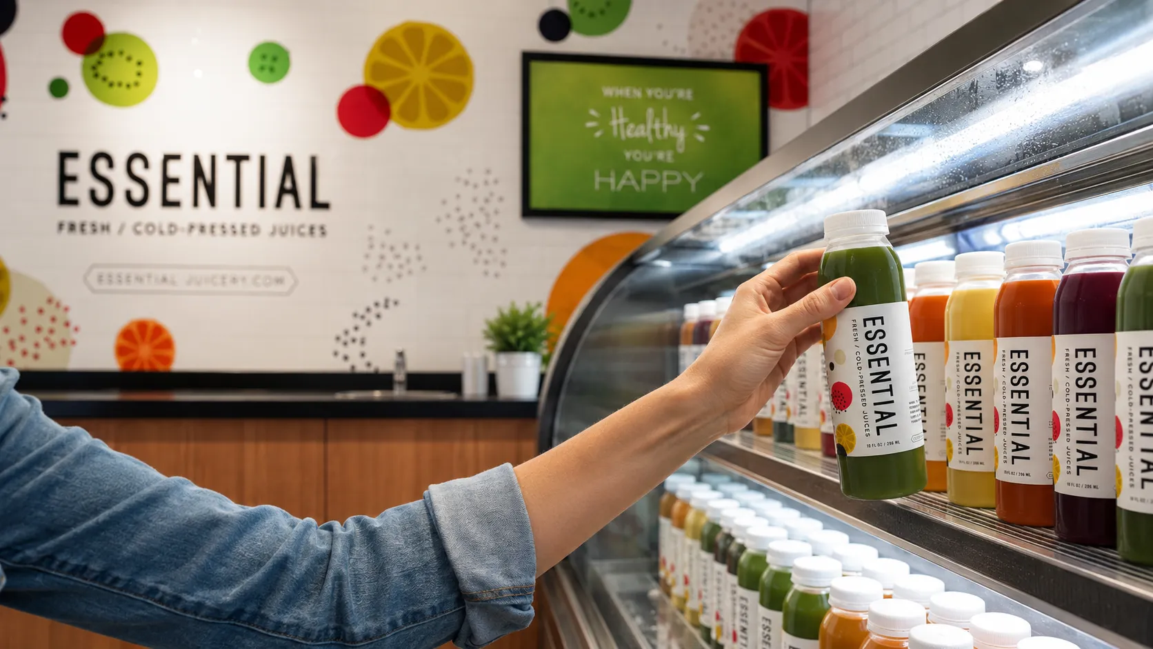
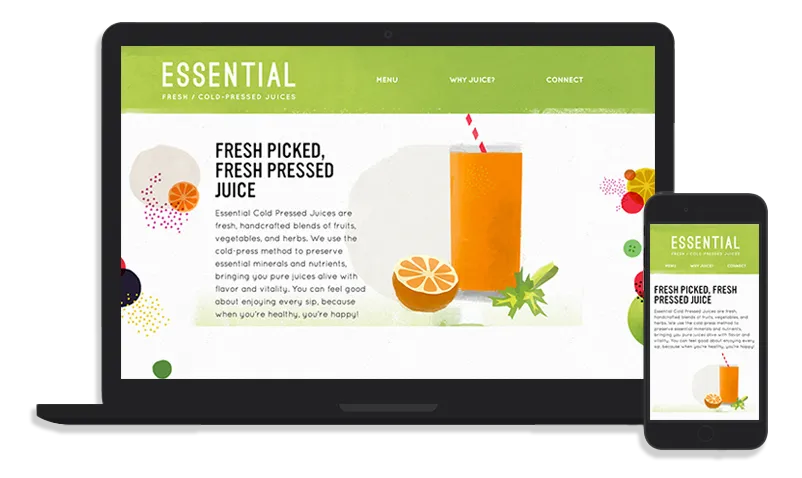
The brand moved beyond the label into the full guest journey: store interior, signage, posters, digital menu boards, responsive website and social media. Each touchpoint reinforced the same visual and verbal idea, so guests encountered one connected experience rather than a collection of separate materials.
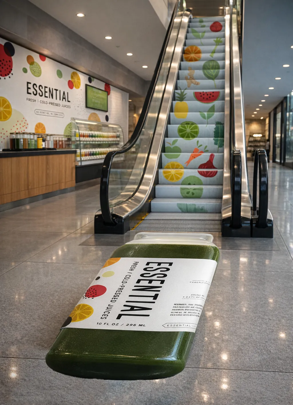
04 / Launch awareness
To build awareness beyond the storefront, we developed an ambient advertising concept for nearby mall traffic. Ingredient graphics appeared to flow down an escalator toward an oversized Essential Juicery bottle—turning movement through the space into a simple demonstration of what went into every juice.
The system in use

How the pieces connected
The Brand Worked Because Every Touchpoint Did.
- Positioning
- →Naming
- →Identity
- →Packaging
- →Store + digital
- →Recognition + demand
Each decision strengthened the next. Positioning clarified the promise. Naming made the products easier to remember. Identity connected the line. Packaging carried the brand into the guest’s hand. The store and digital experience made that same promise visible at every scale.
The impact
A Brand With Pull.
After launch, the brand did more than organize the product. It helped create visible demand around the business.
Guest demand
Regular sell-outs
Archived project records report that the store was regularly selling out of juice after launch.
Employer appeal
A sought-after place to work
The strength of the brand and product helped make Essential a highly desirable place to work.
Business value
Acquisition interest within year one
Before the first year was over, the owner received an inquiry about buying the company.
Creative validation
Three industry recognitions
The work appeared in the 2014 AIGA Minnesota Design Show and received two Silver honors from the 2014 Summit Creative Awards, including recognition for the escalator advertising concept.
The strongest signal was not a single award. It was that a small independent shop emerged with a brand that felt coherent, desirable and capable of carrying more than one bottle—or one location.
What’s next
Built Beyond Opening Day.
The system gave Essential a brand that could extend across new flavors, seasonal campaigns, channels and potential locations without reinventing itself each time. More importantly, the work showed how a restaurant brand can make the business itself more attractive—not only to guests and employees, but to potential buyers.
Explore More Impact Stories
Build a more profitable restaurant.
Make The Product Easier To Choose—And The Business Harder To Ignore.
Strong restaurant brands do more than look good. They clarify the concept, connect the guest experience and create a platform the business can grow on.
Let’s Talk Growth