Brand build/Parallel Cafe
Creating The Brand At The Heart Of A Creative Campus.
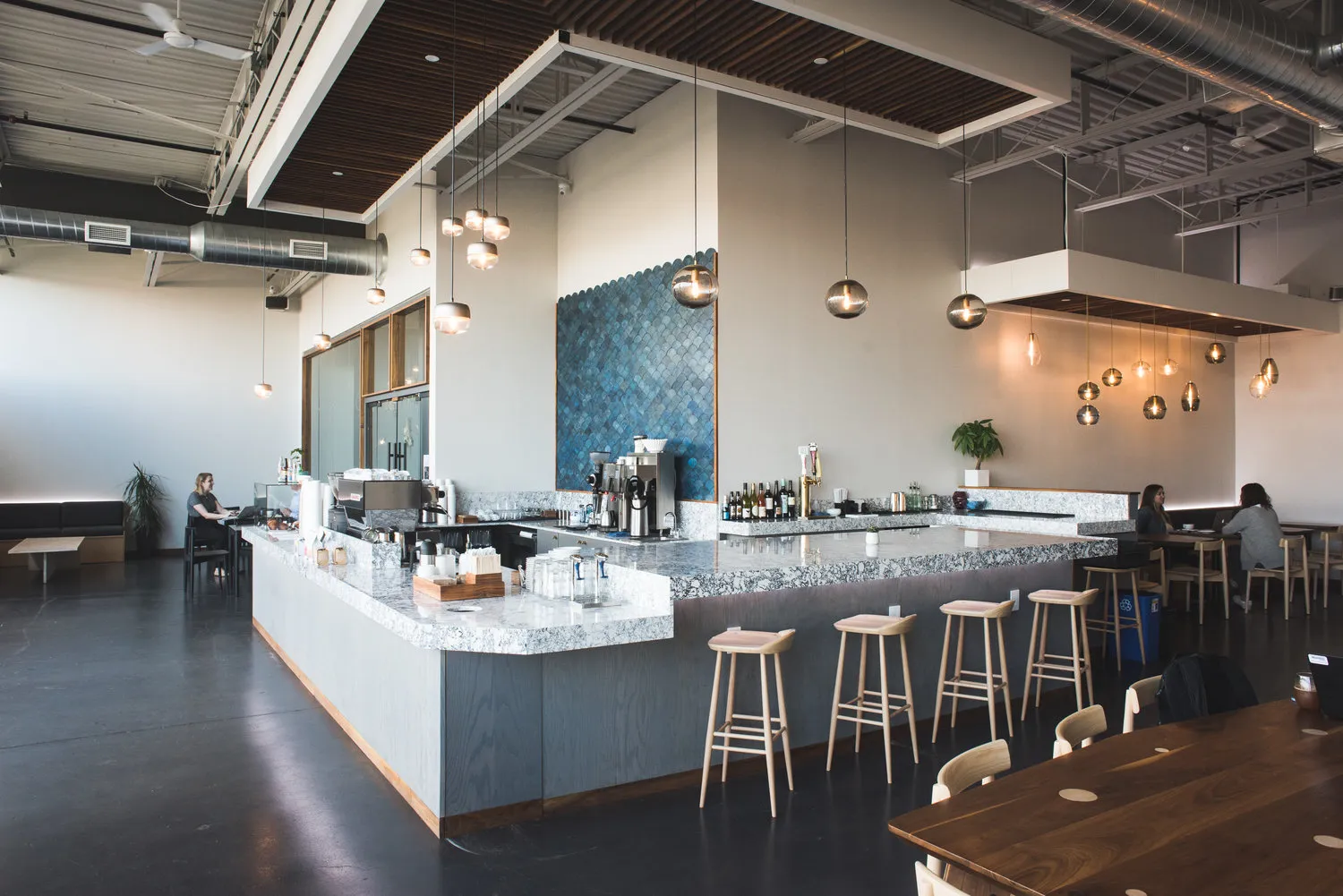
Parallel began as a small espresso-bar idea inside Hennepin Made’s new creative campus and grew into a full 75-seat cafe before opening. We built an identity that connected the cafe to the craft and architecture around it while giving the concept a clear public face of its own.
- Client
- Parallel Cafe
- Restaurant context
- New independent cafe / Root District, Minneapolis / Opened early 2018 / Approximately 75 seats
- Role
- Brand identity, logo system, color and typography, branded applications and style guide
- Solutions
- Marketing
- Engagement
- Brand build and launch
- Primary outcome
- More Visible / Consistent
The restaurant
A Cafe Built To Bring A Creative Campus Together.
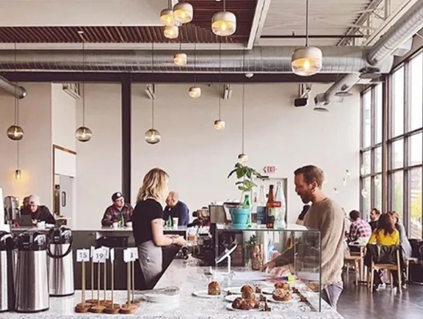
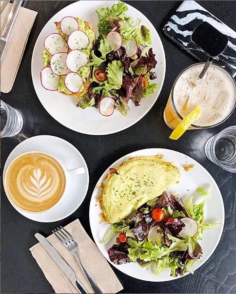
Parallel opened in early 2018 inside Hennepin Made’s 30,000-square-foot creative campus near the Minneapolis Farmers Market. What began as a planned 15-seat espresso bar expanded into an approximately 75-seat cafe serving coffee, breakfast, lunch, beer and wine.
The name reflected the relationship between two crafts practiced under one roof: coffee and glassblowing. It also connected to Hennepin Made’s Parallel line of light fixtures above the bar. The cafe needed to express that idea without becoming an extension of the lighting company or disappearing into the building around it.
What was happening
The Space Already Had A Strong Point Of View.
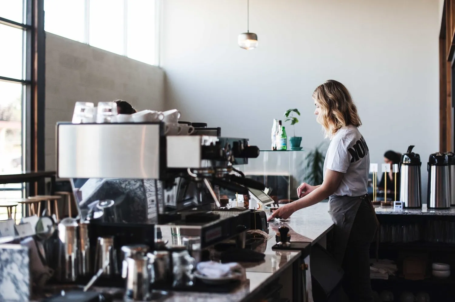
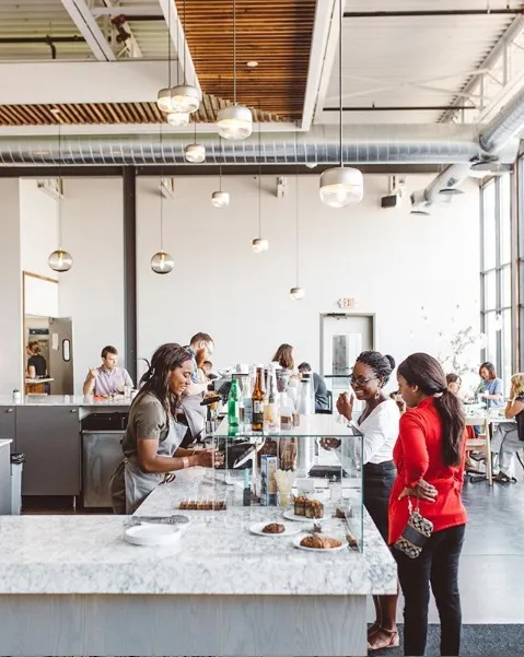
Parallel was one part of a larger maker campus that combined glass production, co-working, retail and events. The cafe’s high windows, sculptural lighting, graphic surfaces and prominent central bar gave the room an immediate visual presence before a logo appeared.
The identity had to hold its own in that environment while feeling natural within it. It needed to work on the building, on a cup and across everyday guest materials, giving people a consistent way to recognize the cafe beyond a photograph of the interior.
What we saw
The Brand Needed Its Own Center Of Gravity.
We saw an opportunity to turn the idea of parallel paths into a visual system. The cafe could share the campus’s respect for craft and precision while speaking in a warmer, more public-facing voice.
A strong serif wordmark gave the brand confidence and clarity. A circular line mark built around the letter P introduced movement, repetition and connection. Together, those elements could shift between signage, cups, cards and other small touchpoints without losing recognition.

What we changed
A Clear Identity For A Flexible Place.
01 / Identity concept
We built the visual identity around the meaning already embedded in the Parallel name. The system expressed two crafts, different people and varied uses moving alongside one another inside the same building.
02 / Logo and visual system
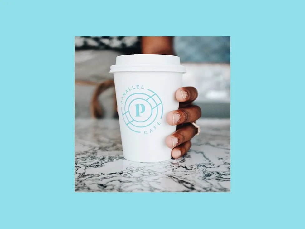
The identity paired a distinctive lowercase serif wordmark with a circular P symbol constructed from intersecting lines. A restrained deep-blue and aqua palette helped the work feel modern and precise while complementing the cafe’s light, material-driven interior.
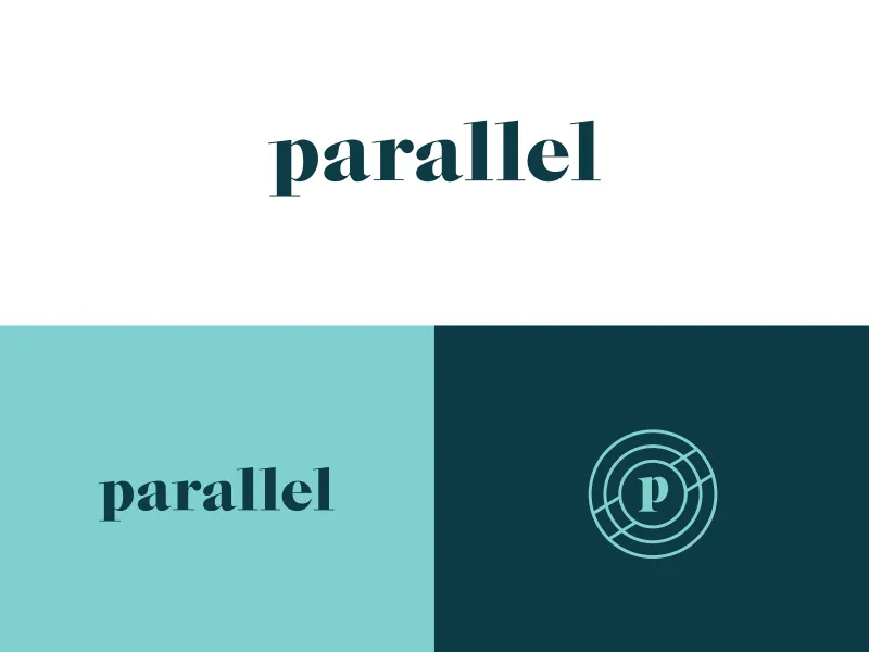
03 / Everyday guest touchpoints
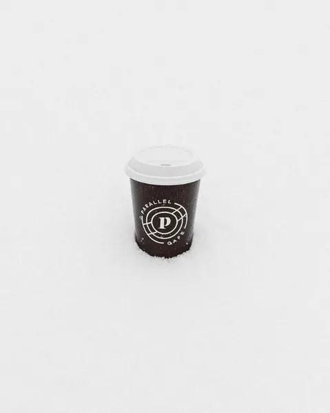
The system moved into the guest experience through exterior signage, cups, business cards and other branded applications. The wordmark handled broad recognition while the compact circular mark gave smaller objects a recognizable signature.
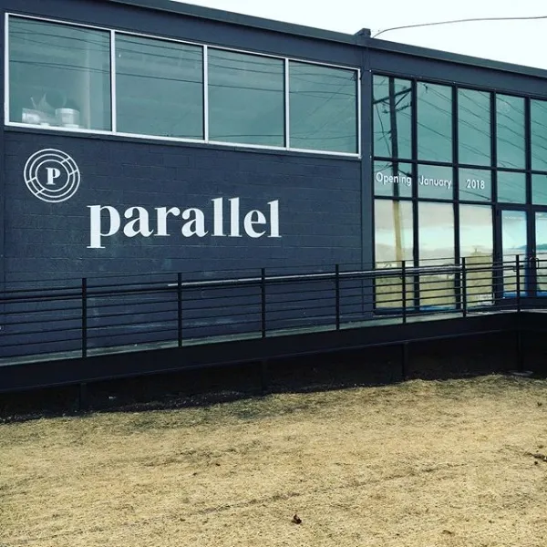
04 / Style guide and rollout
We organized the identity into a style guide so the cafe could apply it consistently as the concept opened and evolved. Clear rules for the marks, typography, color and applications protected the relationship between the brand and the space.
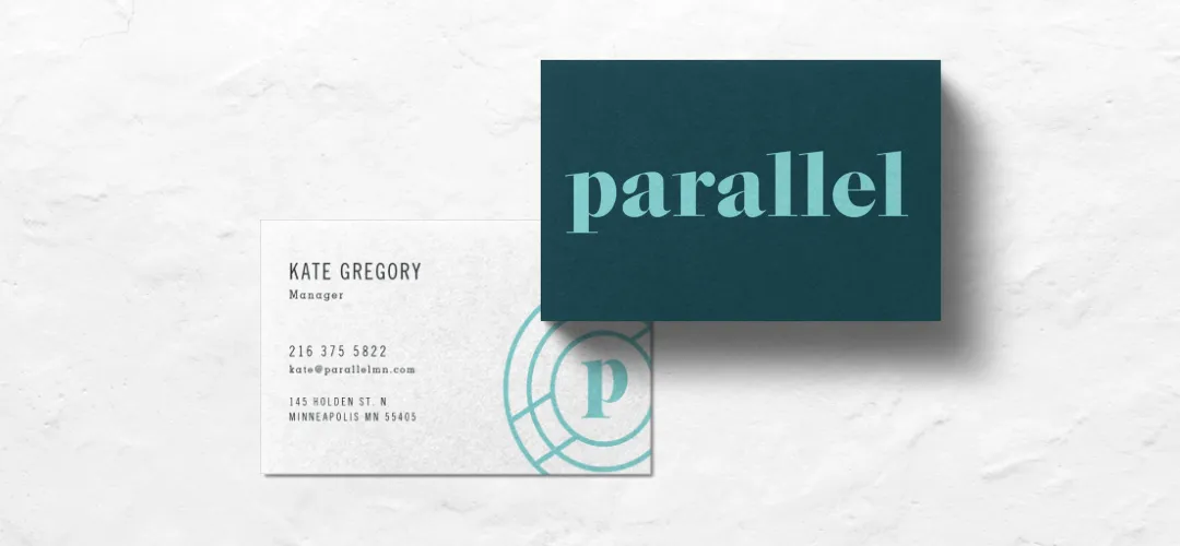
The brand in the room
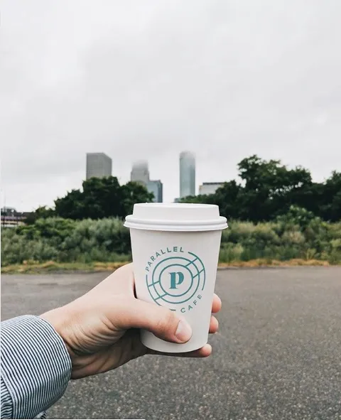
How the pieces connected
The Cafe Became The Campus’s Public Face.
- Campus idea
- →Brand concept
- →Logo system
- →Physical touchpoints
- →Recognition
- →Discovery
The campus idea gave the identity its meaning. The wordmark and symbol made that idea recognizable. Signage introduced the cafe from the street, and cups and printed pieces carried it into the guest’s hand. Together, the system gave a complex, multi-use place a simple public entry point.
The impact
A Place People Wanted To See And Share.
Parallel opened as a substantially larger concept than first planned and quickly drew attention for the relationship between its food, coffee and highly designed environment. The identity gave that experience a consistent name and recognizable set of marks across the touchpoints guests encountered.
Campus visibility
A distinct public face
The identity gave the cafe its own recognizable presence within a larger creative campus.
Brand consistency
One system across the visit
The wordmark and circular mark connected exterior signage, cups, cards and other everyday touchpoints.
Earned attention
A design-led destination
Parallel drew regional and design-industry coverage for the cafe experience and its relationship to the Hennepin Made campus.
Community role
The heart of the campus
Later coverage described the cafe as the social center of the complex for workers, visitors and creative collaborators.
Later coverage described the cafe as the heart of the creative campus. Design publications also noted how often guests photographed the space and its central bar. The brand did not create those physical features, but it gave the experience a clear signature people could recognize and carry beyond the room.
What’s next
The Campus Moved Into Its Next Chapter.
Parallel has since closed, and the former cafe has been transformed into the Glenwood Lounge within Glass House. The building continues its original purpose as a place for gathering, events and creative work, even though the standalone Parallel identity is no longer active.
Explore More Impact Stories


Build a more profitable restaurant.
Build A Brand That Belongs In The Room.
A strong restaurant identity should feel inseparable from the experience around it. When the idea, environment and everyday guest touchpoints reinforce one another, the business becomes easier to recognize, remember and share.
Let’s Talk Growth