Package design/EH Chocolatier
Giving Small-Batch Chocolate A Bigger Presence.
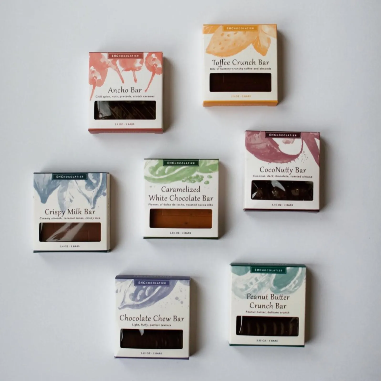
EH Chocolatier made small-batch confections with natural ingredients and classic techniques. We created packaging that made that care visible through painterly color, clear flavor naming, product windows and a flexible structure that could stretch across the assortment.
- Client
- EH Chocolatier
- Restaurant context
- Independent artisan chocolatier / Greater Boston / Founded 2010 / Retail and gifting
- Role
- Packaging concept, visual system, SKU differentiation and package applications
- Solutions
- Marketing
- Engagement
- Packaging design
- Primary outcome
- More Visible / Consistent
The chocolatier
Handmade Chocolate Built Around Freshness And Flavor.
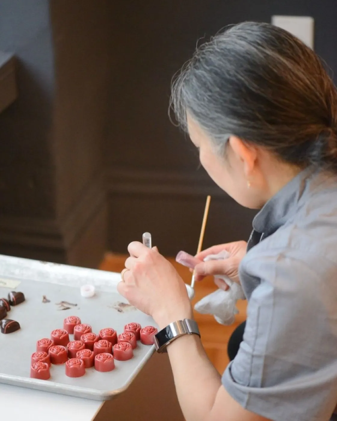
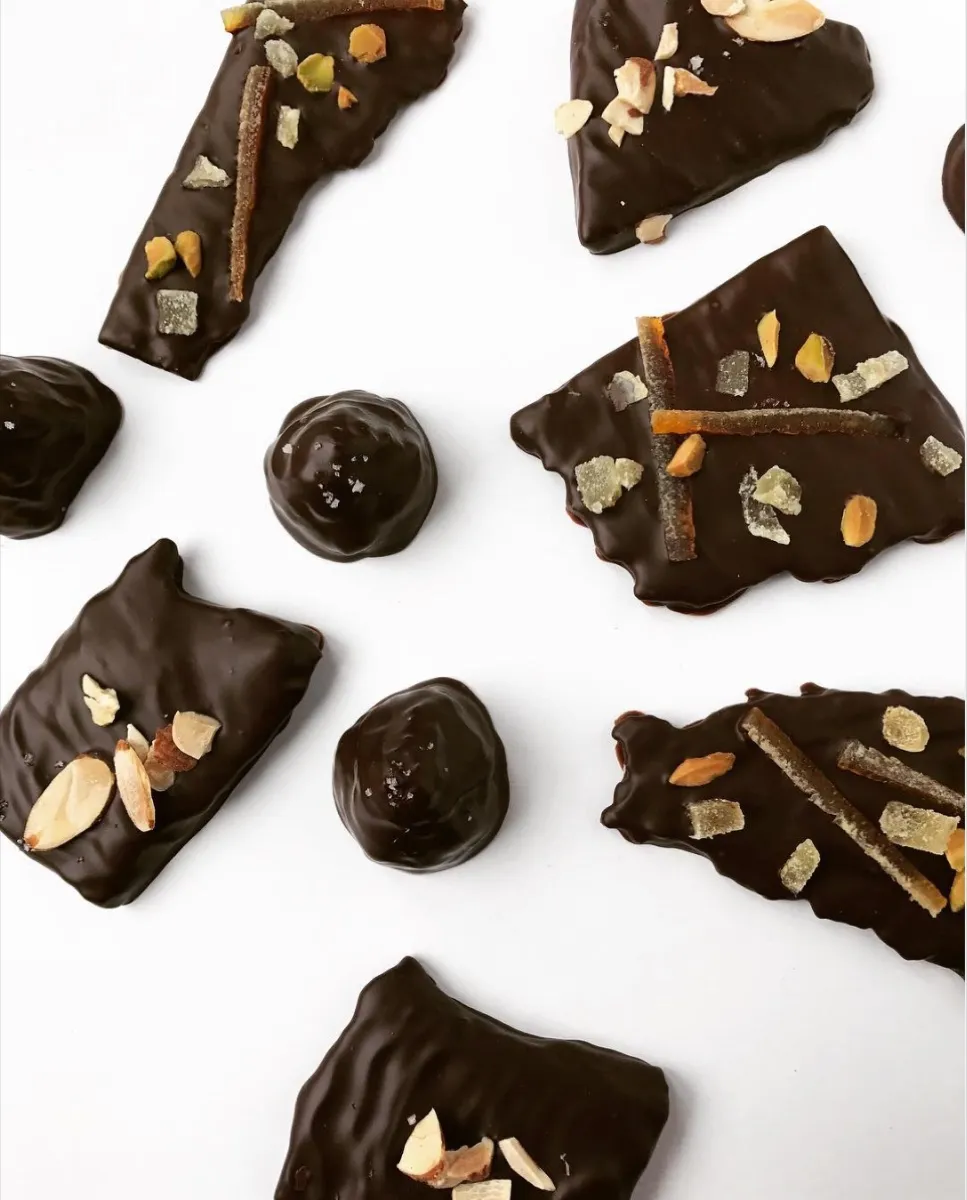
Founded by Elaine Hsieh and Catharine Sweeney in 2010, EH Chocolatier made bonbons, bars and confections by hand in small batches. Fresh and dried ingredients, classic techniques and no artificial flavors or preservatives shaped the product philosophy.
The business had a product people could see and taste as carefully made. The package needed to carry that same impression into gifting, retail display and the moments before the box was opened.
The product
What was happening
Every Flavor Needed Its Own Story. Every Box Needed To Belong.
EH Chocolatier’s bars varied in flavor, texture, ingredients, quantity and appearance. The package had to communicate a lot quickly: what each bar was, what made it distinctive, how much was inside and how it related to the rest of the line.
The system also had to feel refined enough for gifting without making handmade chocolate feel distant or overworked. Clarity, appetite and craft all had to fit on a compact surface.
What we saw
The Product Should Stay At The Center.
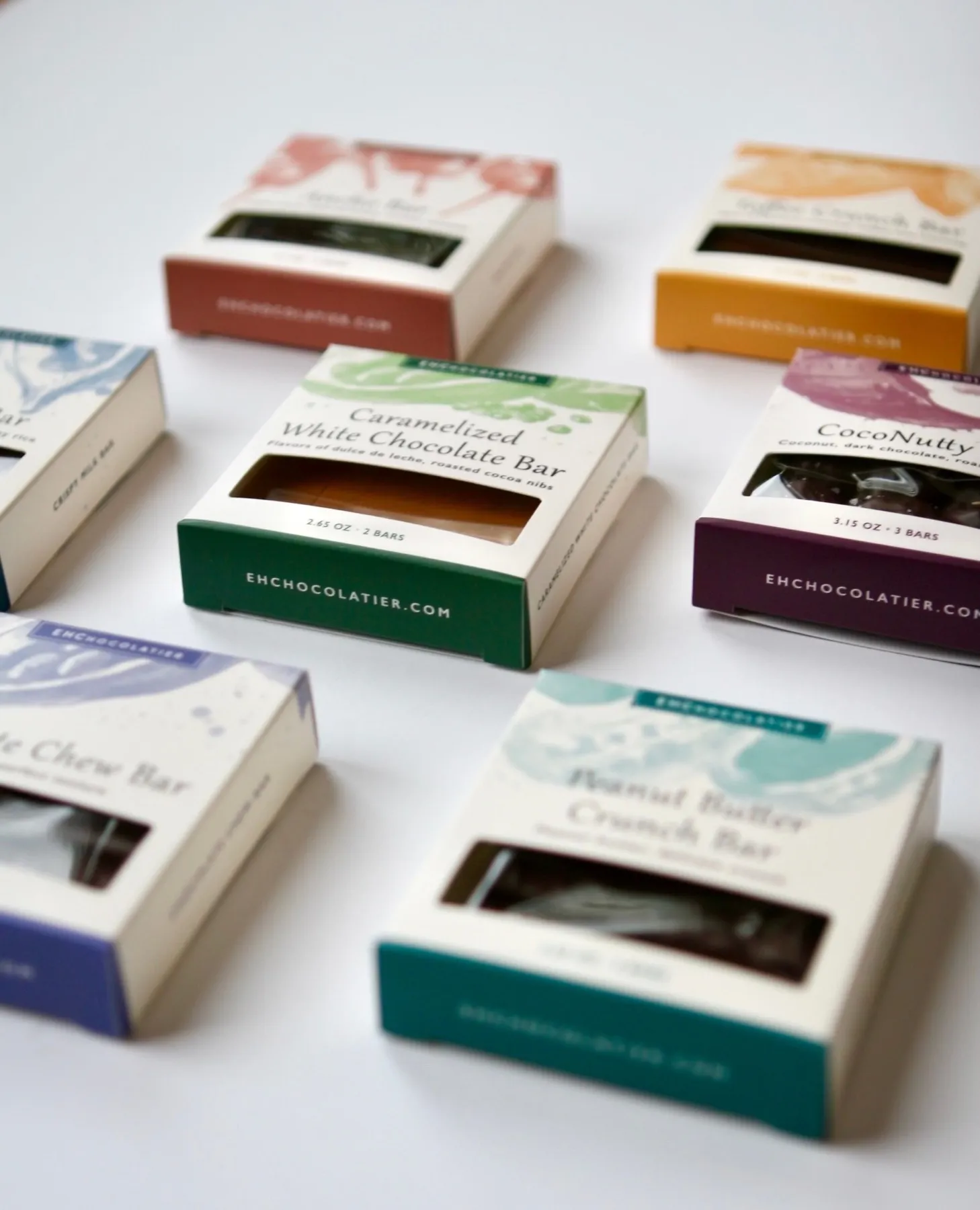
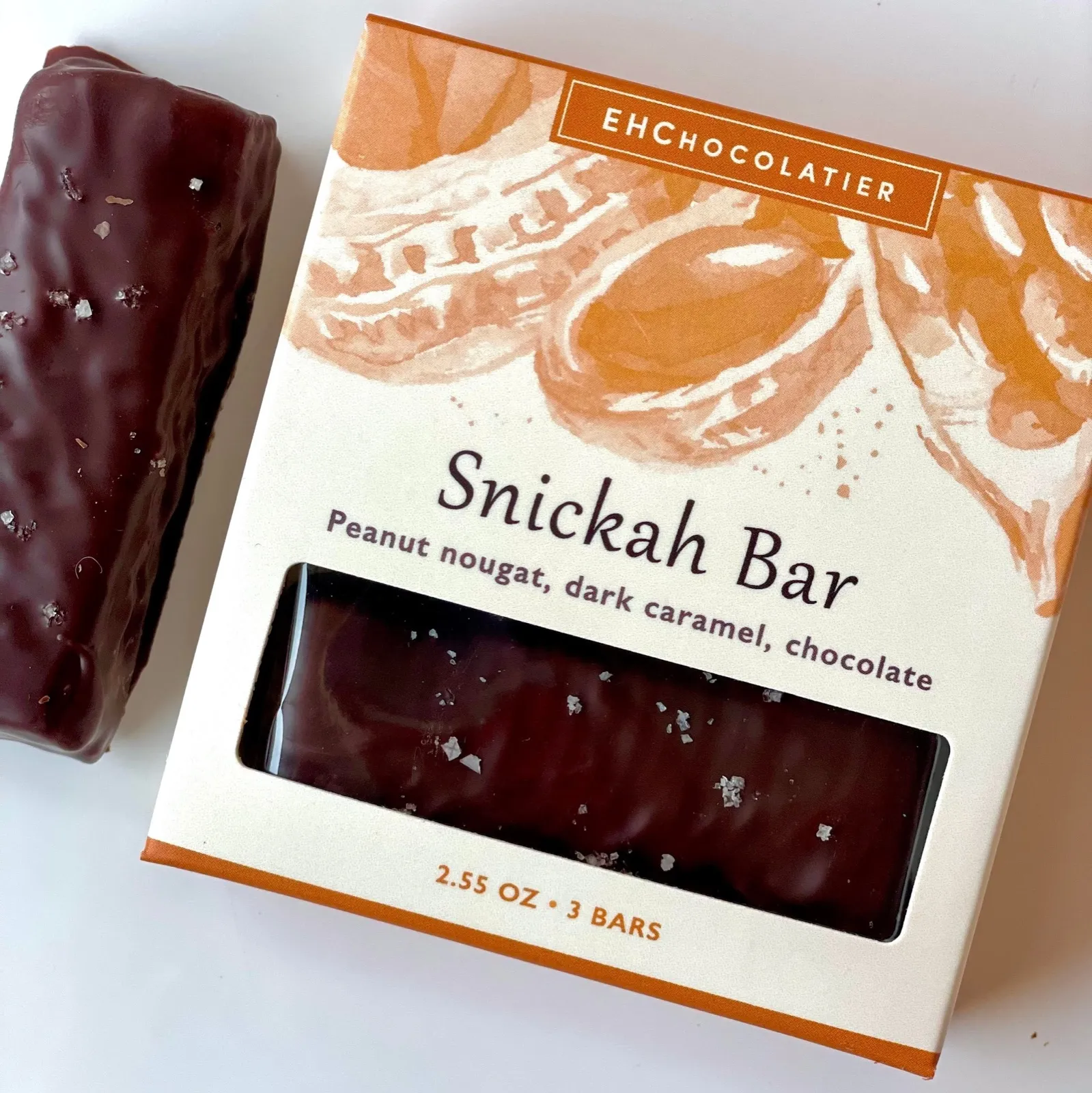
The packaging could let the chocolate participate in the design instead of hiding it behind a generic premium wrapper. A die-cut window gave shoppers a direct view of the bar, while the name and short flavor description handled the decision.
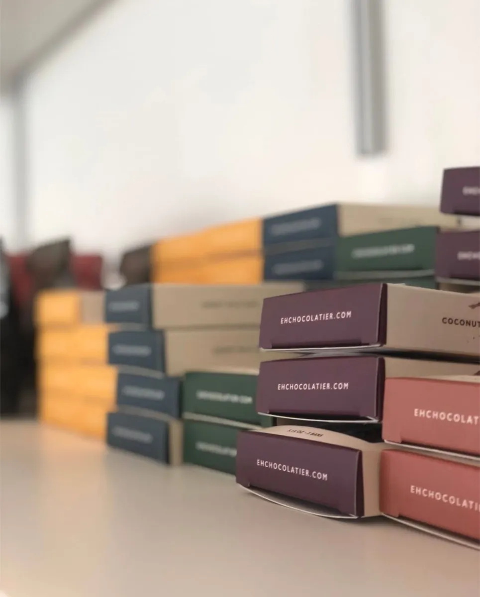
Loose painterly forms and flavor-specific colors added a handmade quality without sacrificing order. A cream base, consistent wordmark and shared type hierarchy kept the full line recognizable.
What we changed
One Packaging System Across The Assortment.
01 / Assortment architecture
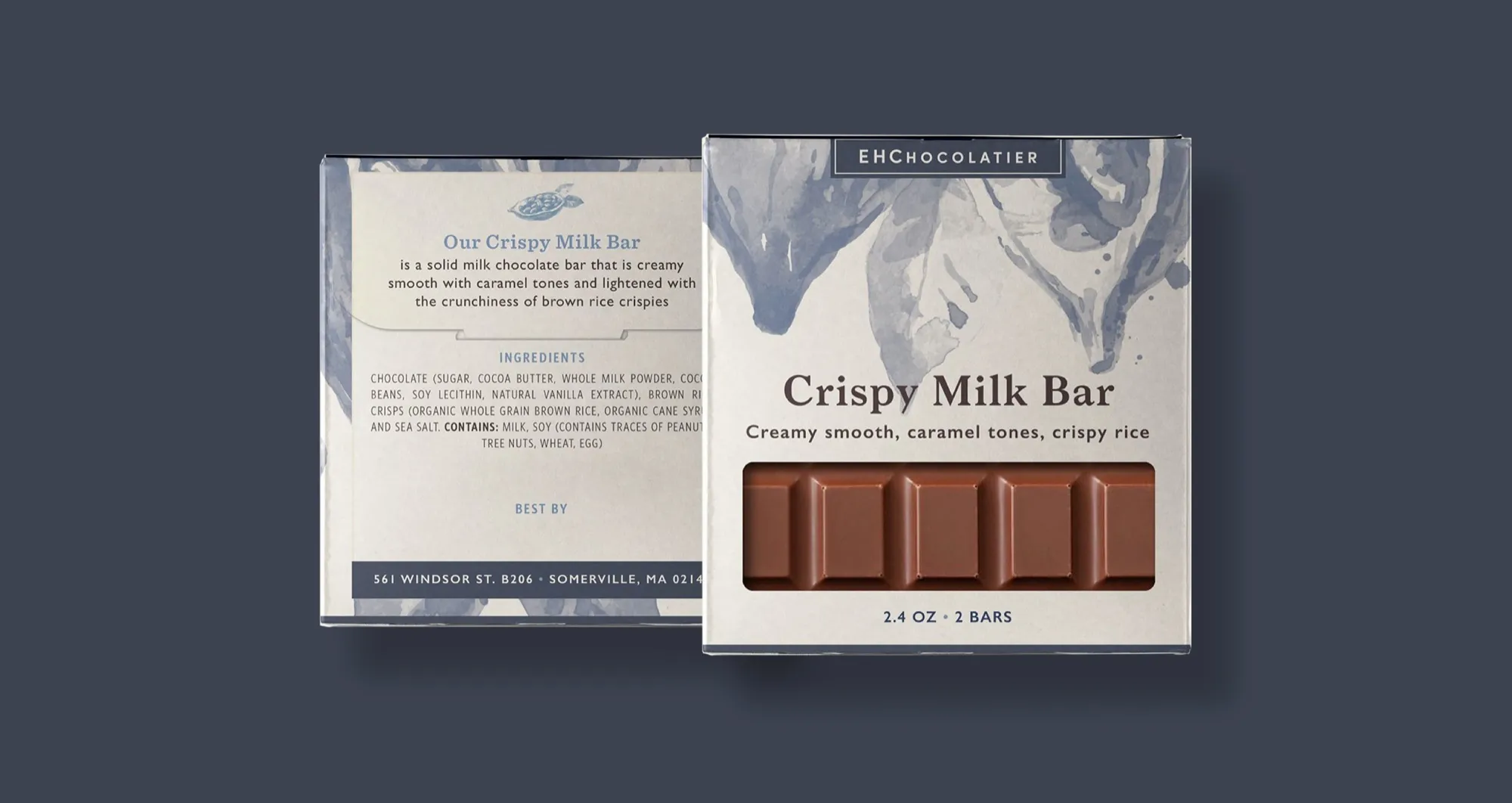
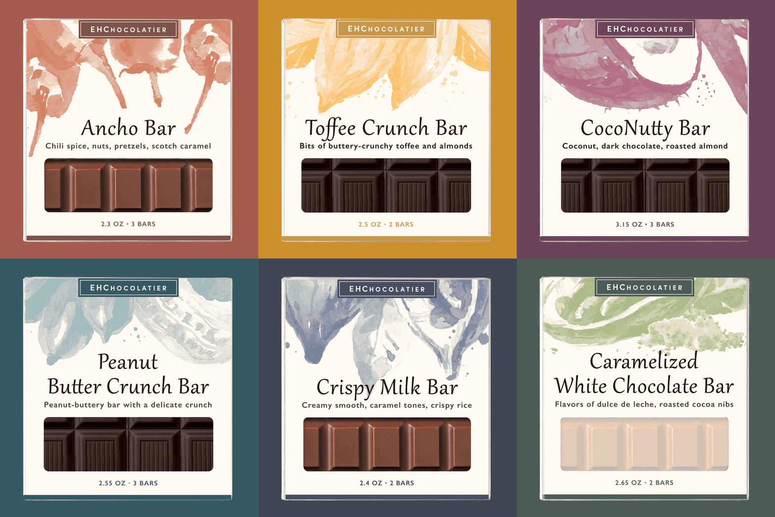
We established a repeatable information hierarchy for product name, flavor description, weight and bar count. The structure made the assortment easy to scan while leaving room for each recipe to communicate what made it different.
02 / Color and artwork
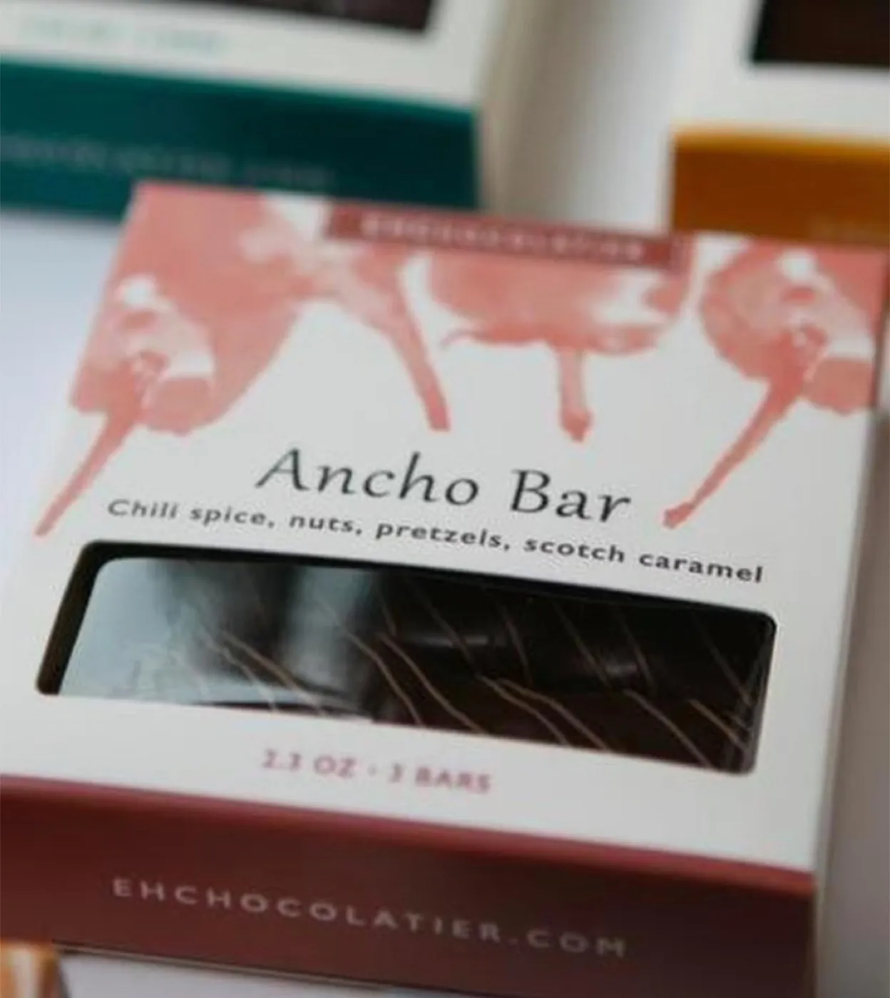
Each variety received its own color and loose, organic artwork. Those expressive marks suggested ingredients and handwork, while the cream field and repeated typography kept the system calm, legible and cohesive.
03 / Product visibility
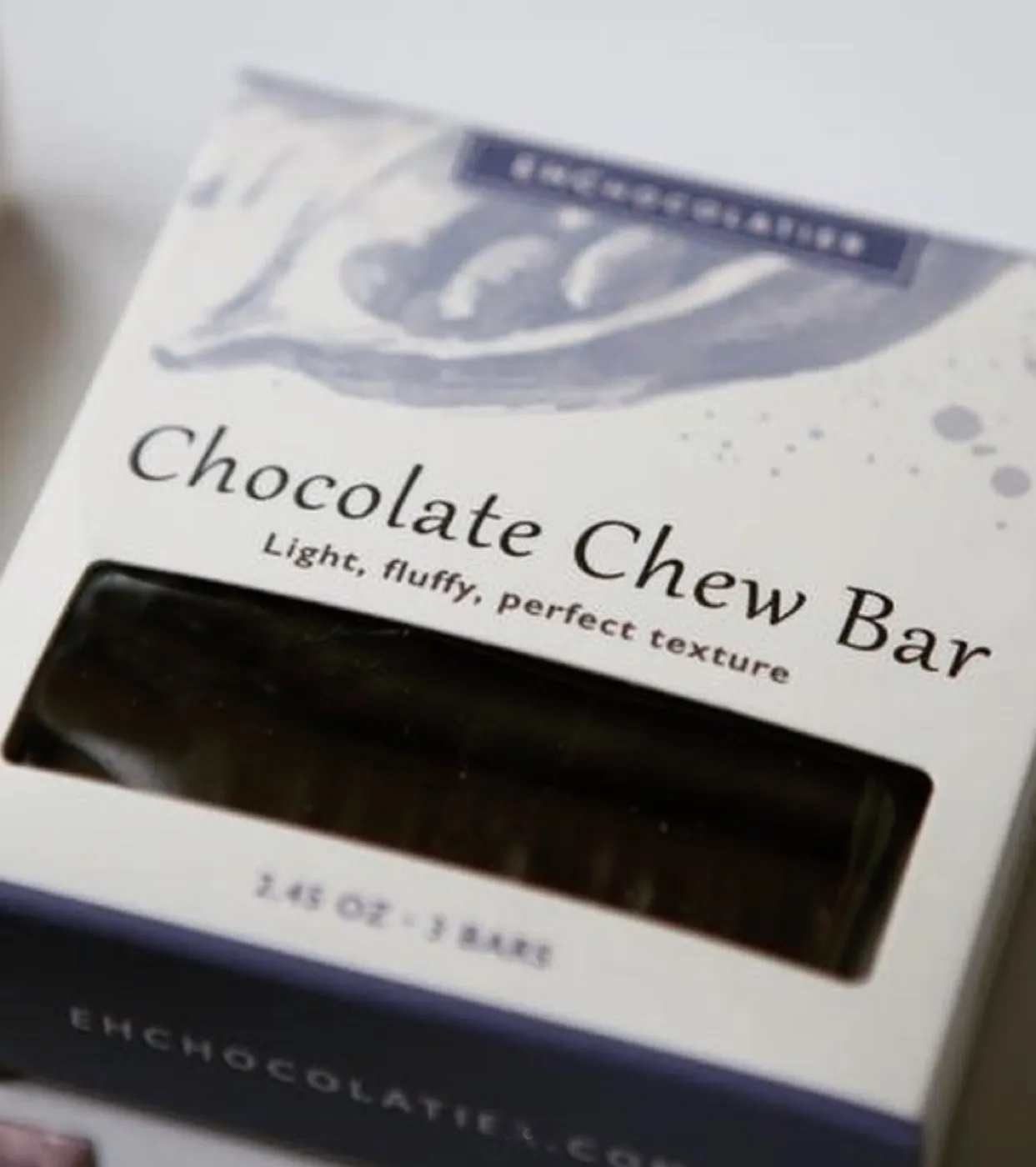
A broad front window showed the actual chocolate before purchase. That simple opening added appetite and trust while helping shoppers compare the color, form and texture of different bars.
04 / Practical package information
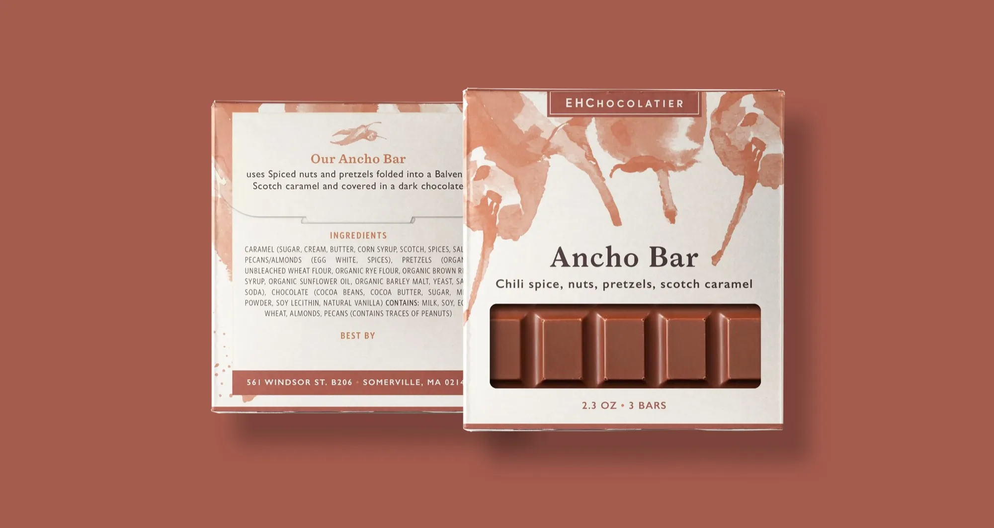
Front, back and side panels carried product descriptions, ingredients, quantities, best-by space and the company URL within the same compact format. The system balanced required information with enough breathing room to preserve the premium presentation.

The retail family
How the pieces connected
Every Detail Helped The Product Sell Itself.
- Handcrafted product
- →Flavor story
- →Color + artwork
- →Product window
- →Clear information
- →Shelf recognition
The product philosophy shaped the flavor story. Color and artwork made each variety distinct. The window created appetite, and the information hierarchy made the choice easier to understand. Together, those decisions carried a handcrafted product into retail without losing its personality.
The impact
A Family That Was Easier To Recognize And Choose.
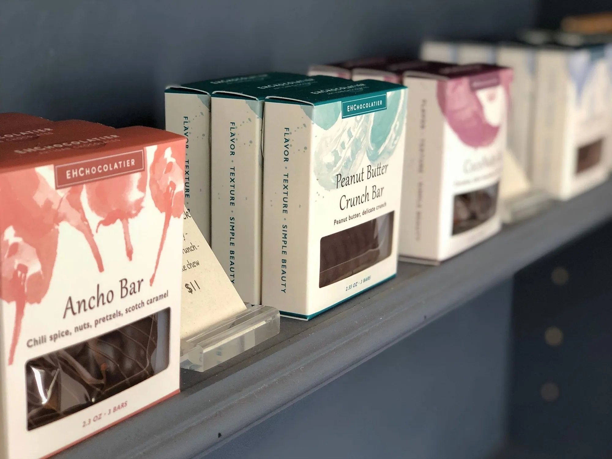
The finished concept turned eight distinct bar varieties into one clear retail family. Each package had its own color and personality, while the repeated structure made the assortment feel connected on a shelf or in a gift selection.
Choice clarity
Clear variety
Flavor names, short descriptions and color coding made the assortment easier to understand and compare.
Appetite appeal
The product in view
Front windows let shoppers see the actual bar, making texture, color and quantity part of the purchase decision.
Brand consistency
One recognizable family
The cream base, wordmark and shared hierarchy connected eight distinct varieties as one coherent line.
Operational usability
Built for real packaging
Front, back and side panels organized ingredients, quantities, product stories and date information within a compact format.
The value was practical as well as visual. The system gave a handmade product enough consistency for retail without flattening the individuality of each flavor.
Explore More Impact Stories
Build a more profitable restaurant.
Make The Package Carry The Product Story.
When a product is handmade, the package has to do more than contain it. It should clarify the choice, protect recognition across the assortment and give the customer confidence before the first bite.
Let’s Talk Growth