Rebrand/FarmTrue
From Small-Batch Ghee To A Full Lifestyle Brand.
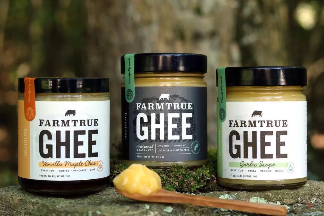
Farm to Gold had found an audience for its small-batch ghee, but the company was preparing for retail and a broader range of Ayurvedic products. We developed the FarmTrue name and a connected identity, packaging and digital system that could carry the business beyond its founding product without leaving its farm roots behind.
- Client
- FarmTrue / formerly Farm to Gold
- Brand context
- Ayurvedic food and self-care brand / Rebranded 2017 / Built for retail and product expansion
- Role
- Naming, visual identity, packaging system, illustration, print collateral and website UI/UX
- Solutions
- Marketing
- Engagement
- Rebrand and product-system expansion
- Primary outcome
- More Scalable / Coherent
The brand
The Product Had Found Its Market. The Brand Needed Room To Grow.
FarmTrue began as Farm to Gold, selling small-batch ghee at local farmers markets. The product gained traction, and the founders saw an opportunity to bring Ayurvedic food and self-care practices to a wider audience.
That ambition changed what the brand needed to do. A name and package created around one food product had to become a credible platform for retail, education and future categories while preserving the company’s connection to farms, nature and seasonal living.
What was happening
A Product Name Could Not Carry A Broader Company.
Farm to Gold was closely tied to ghee and the product’s golden color. As the assortment expanded, the name risked keeping the business anchored to its starting point. The existing identity also needed more presence and flexibility for a retail environment.
The rebrand had to make Ayurveda feel understandable to people who were new to it, organize a growing product family and give food and self-care products distinct roles within one recognizable company.
What we saw
Ayurveda Gave The Brand Its Organizing Idea.
The opportunity was larger than changing the label on a jar. FarmTrue could connect products to the seasonal rhythms and daily practices at the center of Ayurveda, giving the brand a useful story for both packaging and education.
Three rings represented the three Ayurvedic seasons. A cow acknowledged the source of the ghee, and a crown of leaves expressed the brand’s relationship with nature. Together, those elements made an unfamiliar wellness philosophy feel grounded in recognizable ingredients and origins.
What we changed
A Name And System Built For More Than Ghee.
01 / Naming and brand position
FarmTrue replaced Farm to Gold with a name broad enough to hold food, beauty and daily practice. The Nourished by Nature idea kept the brand close to its agricultural beginnings while allowing the story to expand beyond a single product.
02 / Identity and illustration
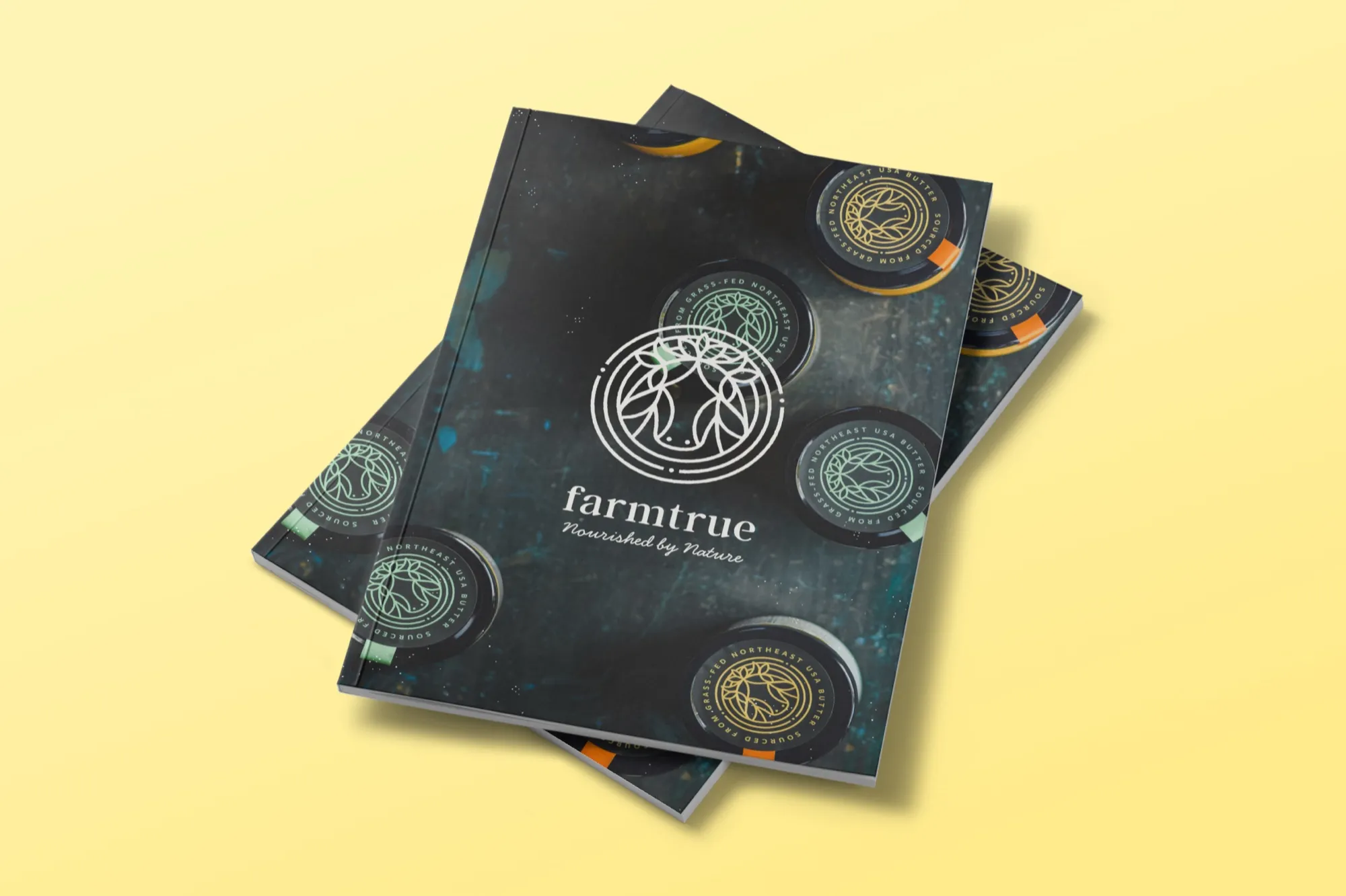
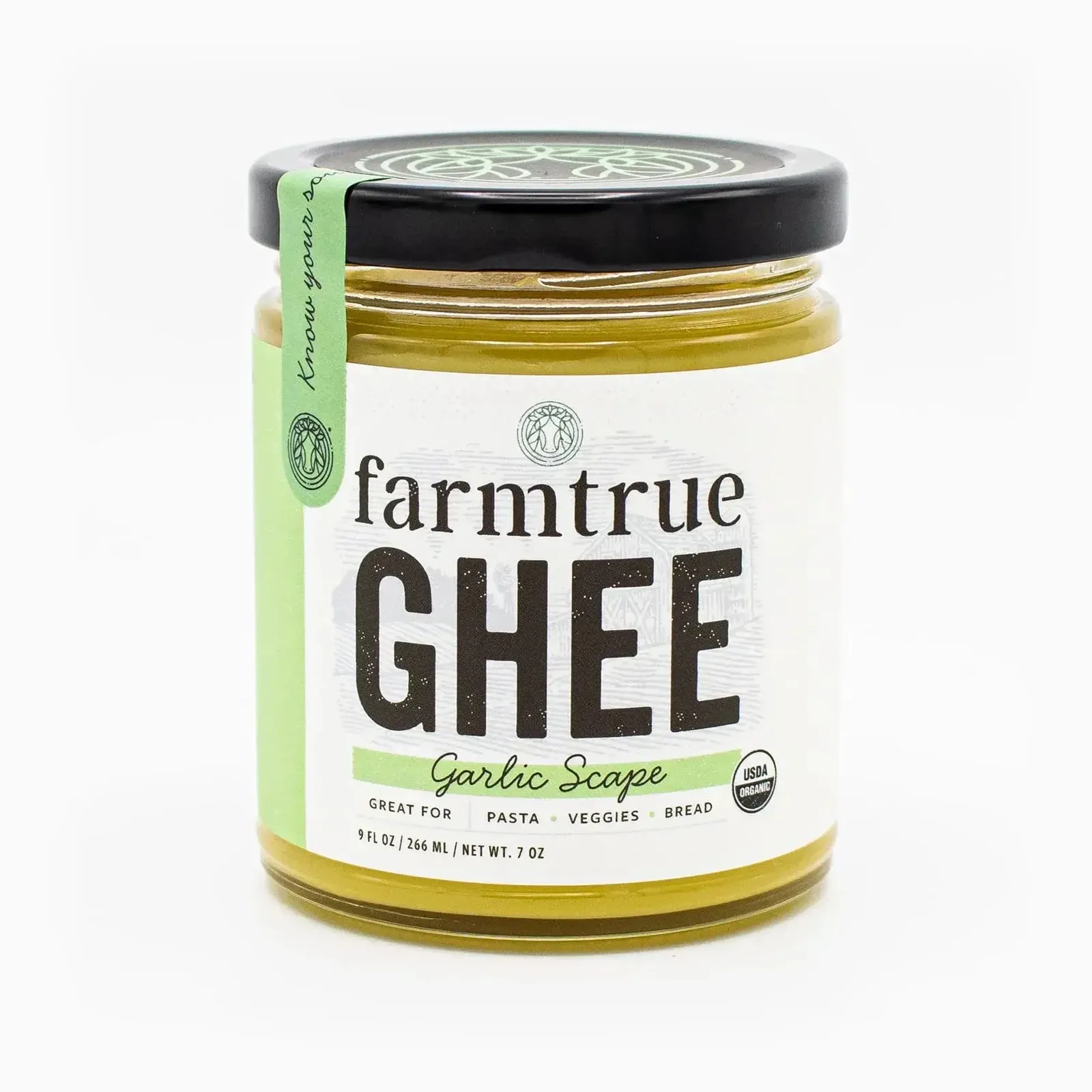
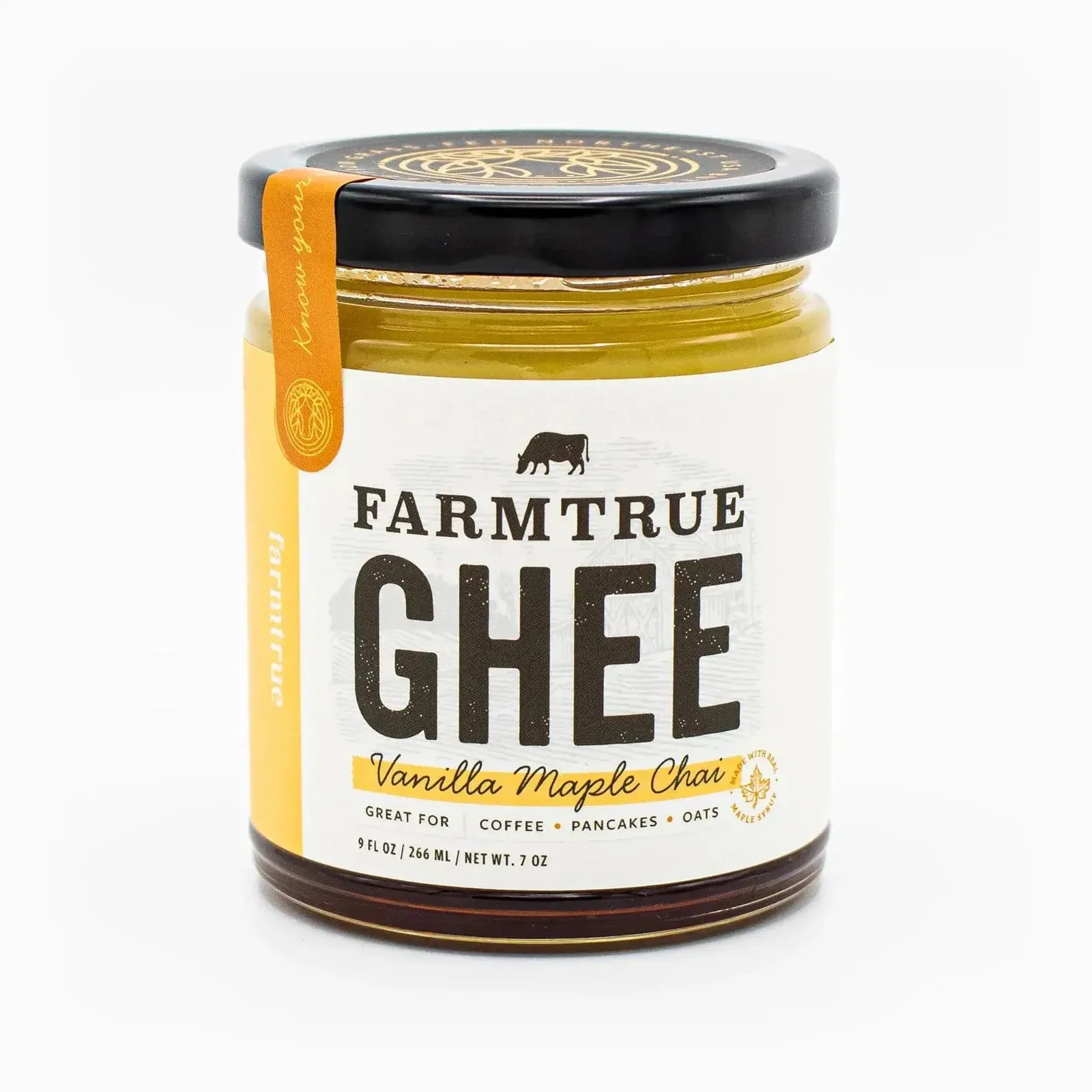
The cow-and-leaf mark, three-ring structure, typography and illustration style created a visual language rooted in the farm and organized around Ayurvedic seasons. The system could remain recognizable across jars, boxes, bottles and educational materials.
03 / Food and self-care packaging
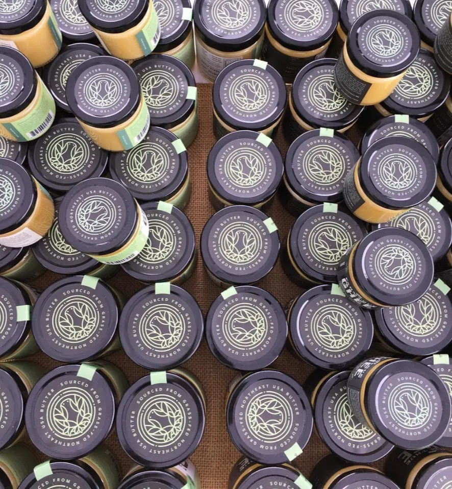
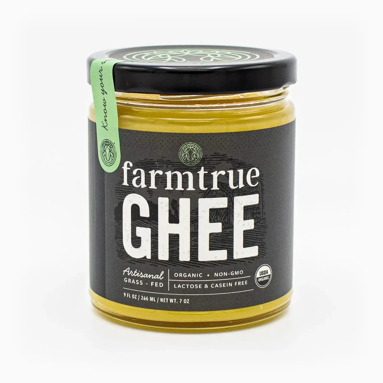
The packaging system gave individual products their own hierarchy while holding the family together. When FarmTrue moved into self-care, the beauty line gained a clearer category expression without losing the warmth and provenance of the food packaging.

04 / Website and brand education
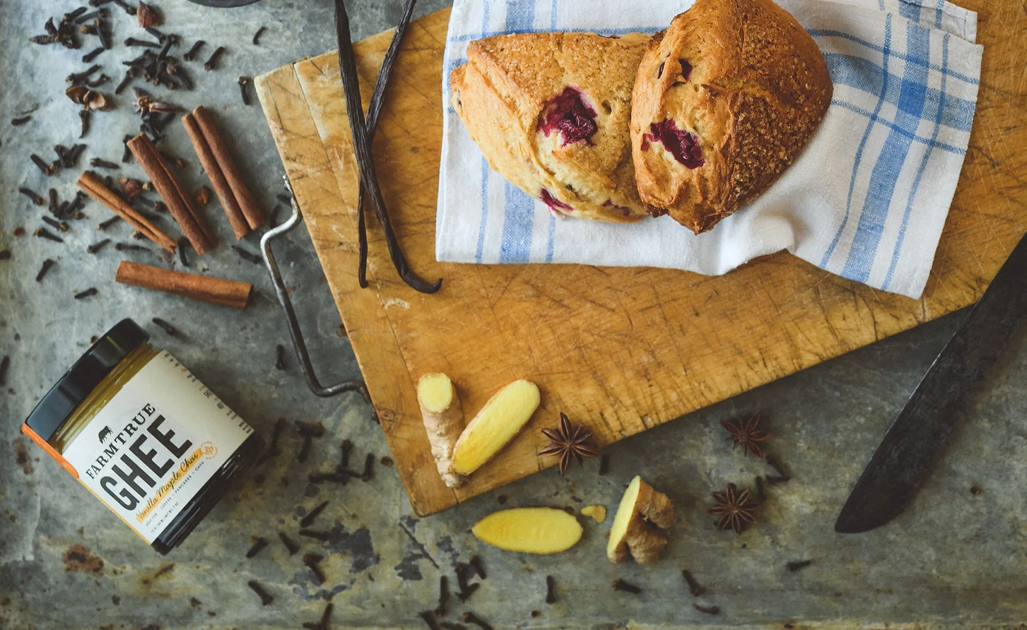
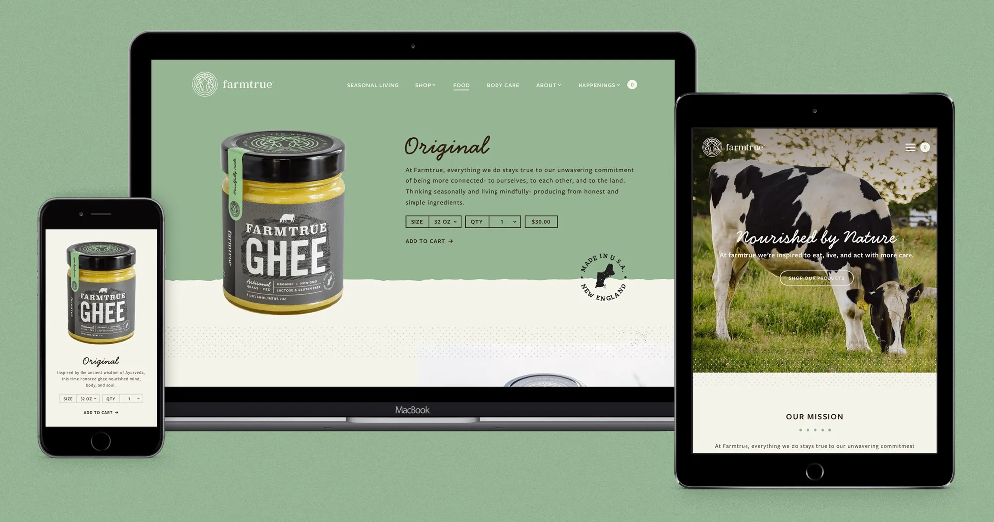
The website paired commerce with an introduction to Ayurvedic living. Seasonal products, events, recipes and educational content helped customers understand how the assortment fit into everyday routines rather than treating each item as an isolated product.
The family
In daily life
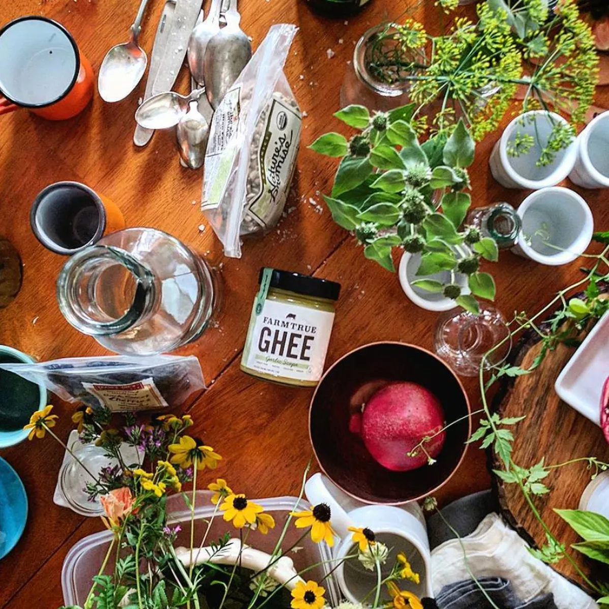
How the pieces connected
One Brand Connected Food, Self-Care And Seasonal Living.
- Ayurvedic seasons
- →FarmTrue name
- →Cow + three-ring mark
- →Food + self-care packaging
- →Retail
- →Education + commerce
Ayurvedic seasons supplied the organizing logic. The FarmTrue name broadened the promise, while the cow, leaves and rings made that promise visible. Packaging carried the system into retail, and the website connected products to the knowledge and routines that gave them meaning.
The impact
The Brand Expanded Without Losing Its Source.
The rebrand gave a farmers-market ghee company a name and visual system capable of supporting a wider Ayurvedic lifestyle assortment. Food and self-care products could speak to different buying contexts while remaining clearly part of FarmTrue.
Brand platform
A broader name
FarmTrue replaced a product-specific name with one capable of supporting food, self-care and seasonal lifestyle offerings.
Retail clarity
One connected family
The identity and packaging system gave a growing assortment a consistent presence across jars, boxes, bottles and printed materials.
Product expansion
Two category expressions
Self-care packaging could distinguish itself from the food line while preserving the same farm roots and Ayurvedic foundation.
Package design
2018 GDUSA recognition
Tyler DeHague’s project record lists FarmTrue in the 2018 American Package Design Annual.
The work also received recognition in the 2018 GDUSA American Package Design Annual. More important to the business story, the FarmTrue name and core cow symbol remain in use as the current assortment spans ghee, face care, body care, food and drink, and lifestyle products.
Explore More Impact Stories
Build a more profitable restaurant.
Build The Brand Before The Product Line Outgrows It.
When a food or wellness company grows beyond its founding product, the name, packaging and story must make the expansion feel intentional. A flexible brand system helps each new offering earn attention without asking the business to start over.
Let’s Talk Growth