Rebrand/Rush River Brewing Co.
Turning Brewery Momentum Into Market Presence.
Rush River was brewing beer people wanted, but its packaging and identity were not helping bottled products compete. We rebuilt the brand around a custom script, flexible flavor system, package family and connected marketing platform that matched the quality of the beer and could grow with the brewery.
- Client
- Rush River Brewing Co.
- Restaurant context
- Independent craft brewery / River Falls, Wisconsin / Founded 2004 / Regional distribution and taproom
- Role
- Market research, brand identity, packaging and flavor architecture, campaign, vehicle graphics, responsive website and ecommerce
- Solutions
- Marketing
- Engagement
- Full-scale rebrand
- Primary outcome
- More Visible / Scalable
The brewery
The Product Had Earned A Following. The Brand Had Not.
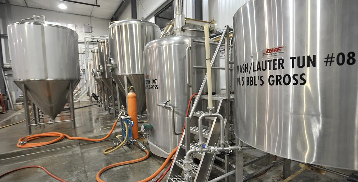
Rush River began in 2004 in Maiden Rock, Wisconsin, producing a limited quantity of draft-only ales. The brewery moved to River Falls in 2007, added a bottling line and expanded its distribution across Wisconsin and Minnesota.
The beer had built a regional following, and keg sales were strong. Rush River described its place in the market as the working man’s craft beer: well made, approachable and more interested in the product than in ceremony.
What was happening
Strong Keg Sales Hid A Bottle Problem.
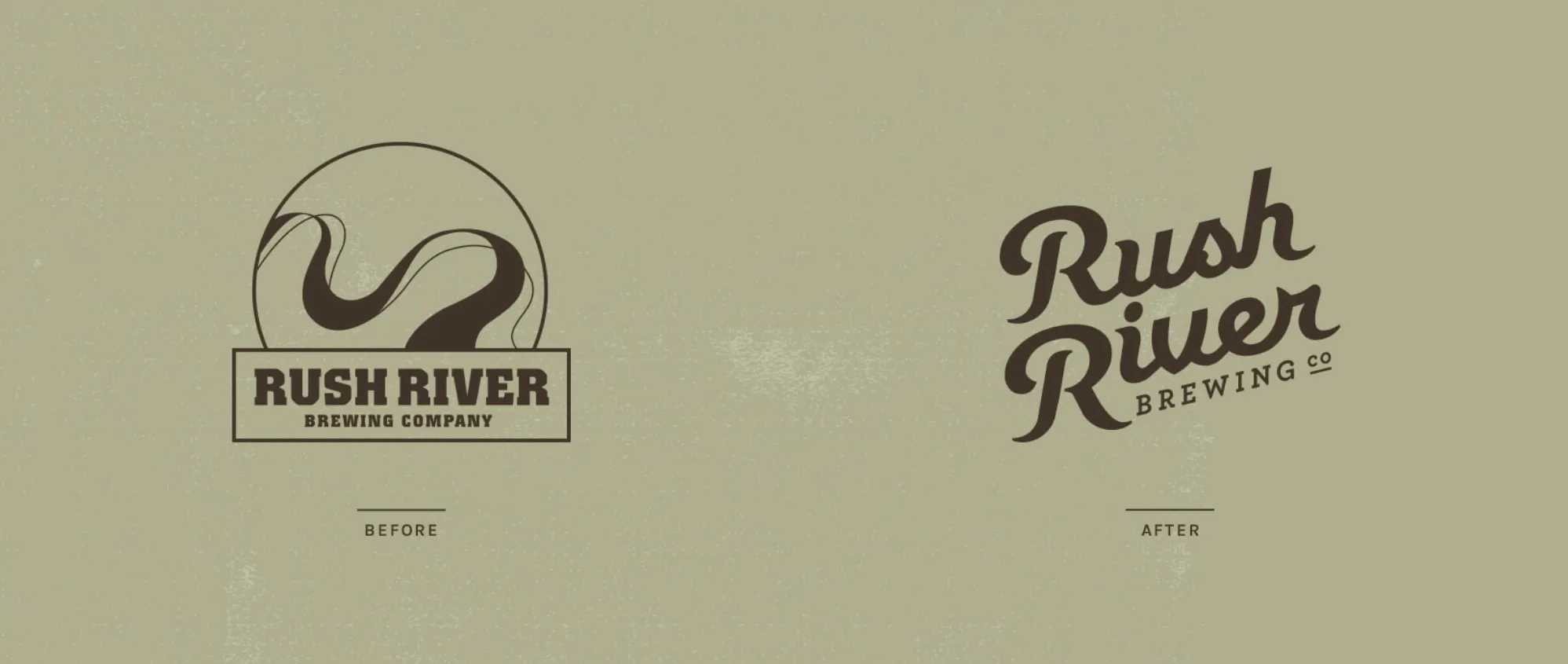
Rush River’s existing identity used an abstract river symbol and blocky typography that felt dated and lacked a clear story. On the shelf, the packaging did not communicate the quality customers already recognized in the beer.
The business results exposed the gap. Westwerk’s historical case study reported that branded bottle sales were trailing keg sales even as keg demand continued to grow. The product had momentum; the consumer-facing brand did not.
What we saw
The Name Needed Motion, Not Another River.
Research into national and regional beer markets found a crowded field of water-themed brewery names and literal river graphics. Repeating the same visual idea would make Rush River easier to confuse, not easier to remember.
A custom, fluid script carried the river idea through the lettering rather than an obvious icon. Paired with the working-man positioning, it gave the brand a modern, classic character that could feel crafted without becoming precious.
What we changed
A Full System, From Bottle To Delivery Truck.
01 / Brand strategy and identity
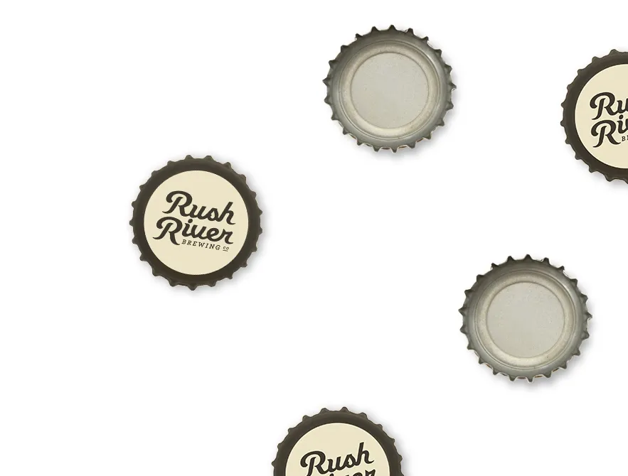
Market research, working sessions and mood boards clarified the brand’s position before design began. We then created a custom script identity with horizontal and vertical formats that could stay recognizable across very different applications.
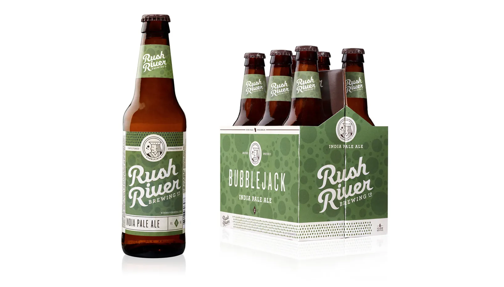
02 / Product and flavor system
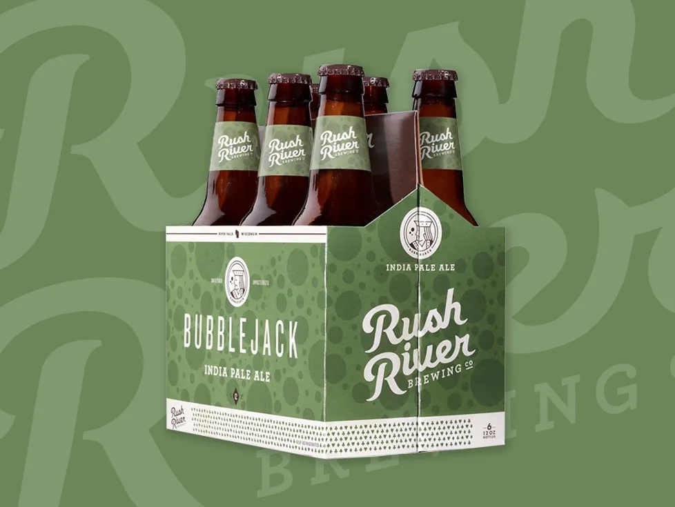
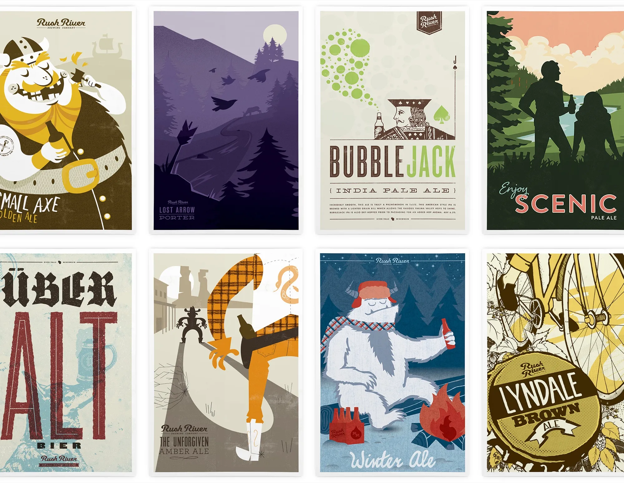
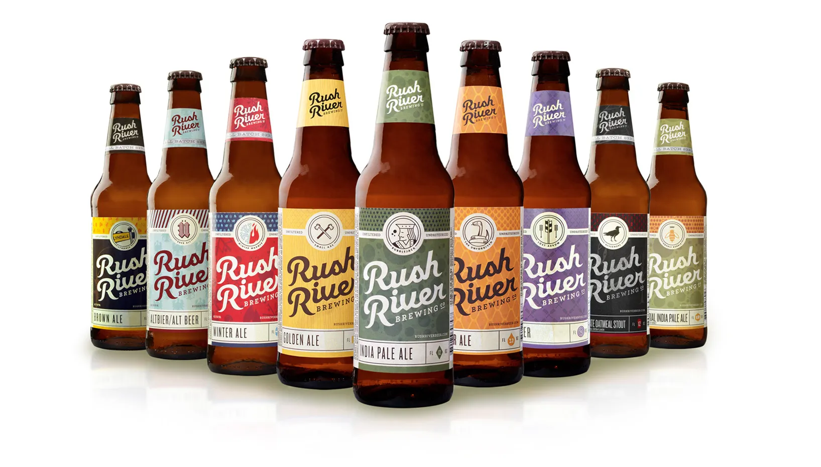
Each beer received a coordinated flavor icon, type treatment, color and pattern. The system gave individual products room to tell their own stories while keeping a growing assortment connected to the Rush River name.
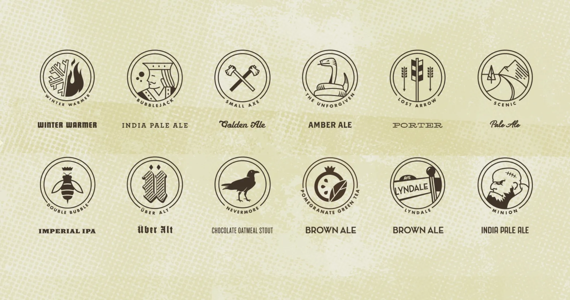
03 / Seasonal mixer packaging
Summer and winter variety packs used two distinct plaid systems: picnic plaid for warm weather and wool plaid for cold weather. The packages created a stronger block on the shelf and reportedly sold out within weeks of production.
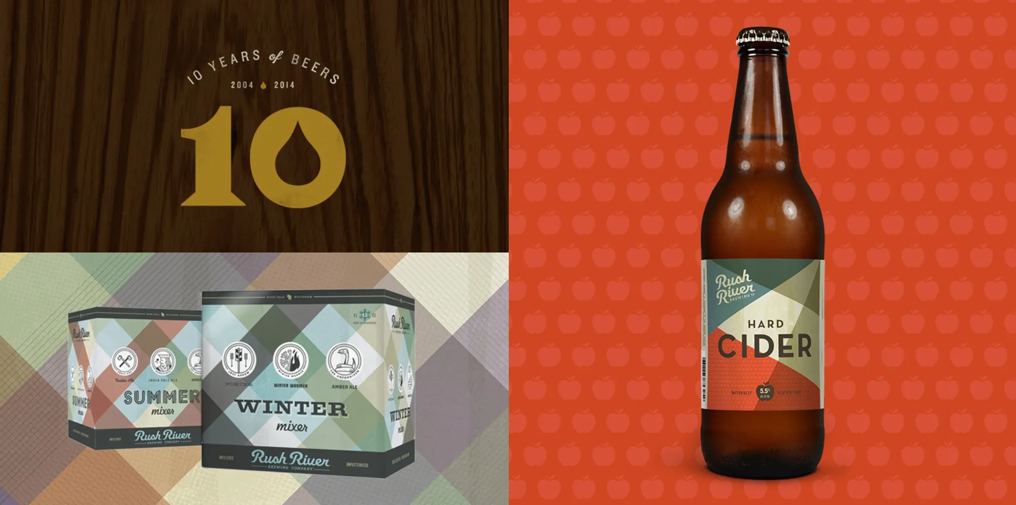
04 / Marketing and digital
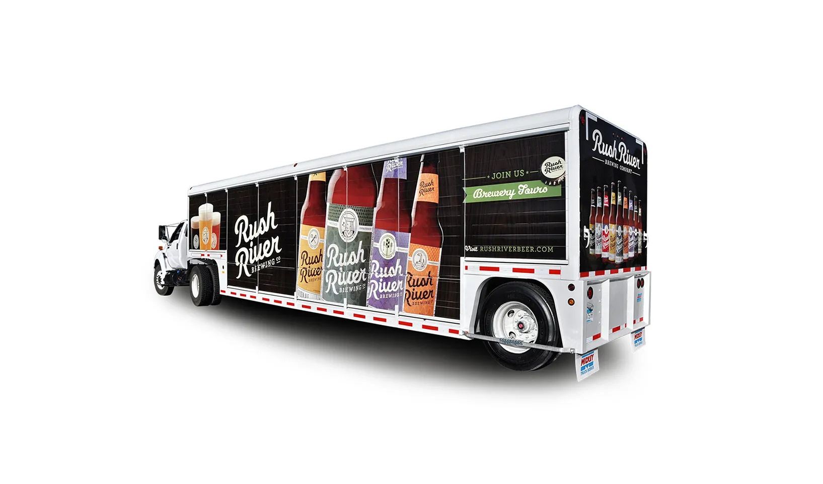
The identity extended into tap handles, posters, collateral, truck graphics, ads and video. A responsive website added ecommerce through WooCommerce, branded content and a vendor portal within the same system.
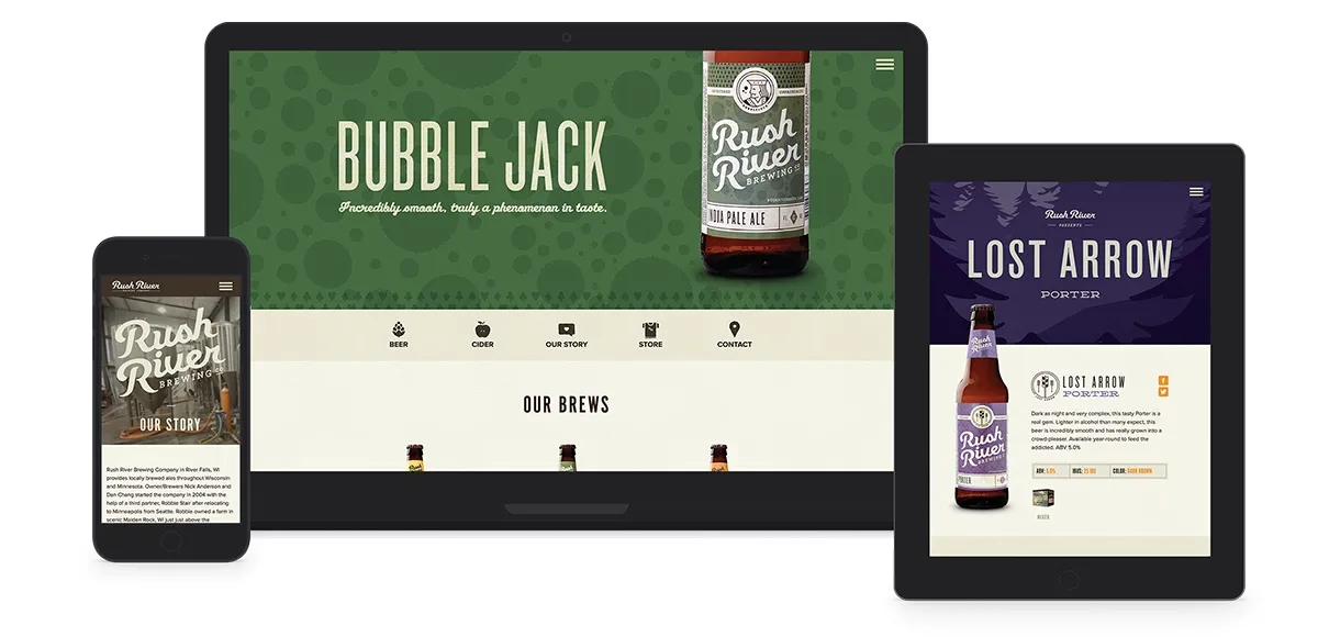
Out in the world

How the pieces connected
Every Product Looked Different. Every Product Looked Rush River.
- Working-man position
- →Custom script
- →Icon + type + color + pattern
- →Packaging
- →Taproom + distribution
- →Digital commerce
The working-man position kept the brand grounded. The script established recognition, while icons, typography, color and pattern organized the product family. Packaging carried that system into stores, and taproom, vehicle, campaign and digital applications connected the shelf back to the brewery.
The impact
More Bottles. More Capacity. A Brand Built To Extend.
After the rebrand, Westwerk reported a 127% increase in bottle sales, a reversal in the keg-to-bottle sales relationship and a 200% increase in brewing capacity. The seasonal mixer packages also reportedly sold out within weeks.
Bottle sales
+127%
Westwerk reported that bottle sales increased 127% after the new brand and packaging launched.
Product mix
Ratio flipped
The historical case study reported that the keg-to-bottle sales relationship reversed after the rebrand.
Brewing capacity
+200%
Rush River reportedly expanded brewing capacity by 200% as the business grew.
Seasonal demand
Sold out within weeks
The summer and winter mixer packages reportedly sold through within weeks of production.
The business expanded on several fronts after launch. The rebrand gave that growth a coherent face across products, distribution, the taproom and digital channels while leaving room for new beers and seasonal releases.
What’s next
Rush River Kept Growing Into The System.
Rush River remains active in River Falls. Its current taproom promotes 32 rotating taps, beer to go, indoor seating for 100, an outdoor pavilion and a wooded lawn. The brewery also maintains a broad bottled lineup spanning year-round and seasonal offerings, reinforcing the need for a brand system that can hold variety without losing recognition.
Explore More Impact Stories
Build a more profitable restaurant.
Build The Brand To Carry The Growth.
When a product is stronger than the story around it, distribution exposes the gap. A clear identity and package system help a growing food or beverage business earn recognition, support new products and make expansion easier to manage.
Let’s Talk Growth