Rebrand/Pikes Peak Brewing Co.
A Local Favorite, Rebuilt For A Bigger Market.
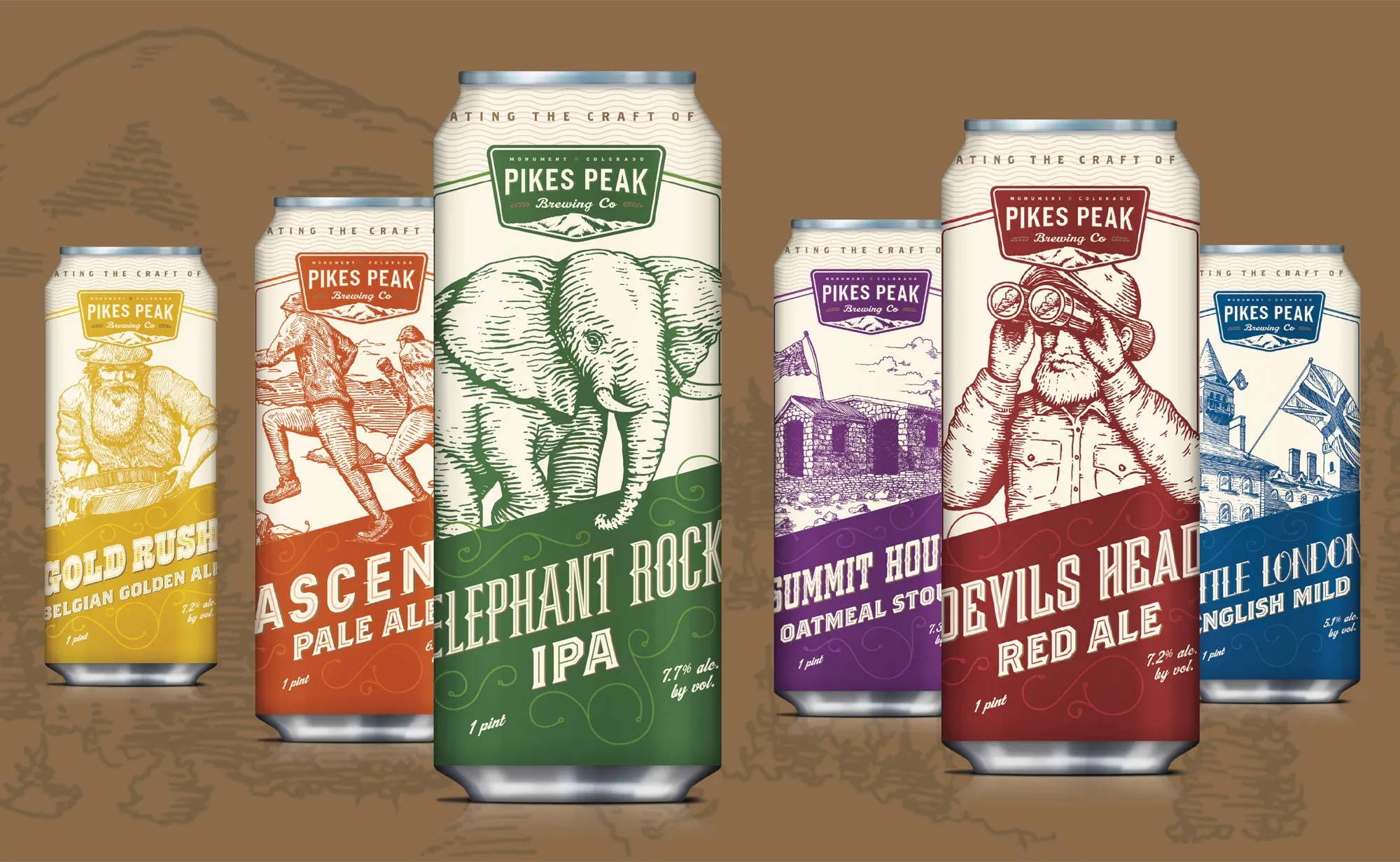
Pikes Peak Brewing had a strong local following and plans to move into canning and wholesale. We rebuilt the identity, packaging and digital system around Colorado’s parks, landmarks and history, giving the brewery a distinctive face across cans, tap handles, campaigns and its website.
- Client
- Pikes Peak Brewing Co.
- Restaurant context
- Independent craft brewery / Monument, Colorado / Taproom and packaged distribution / Six-beer launch assortment
- Role
- Market research, rebrand, packaging, illustration, launch campaign, responsive website and ecommerce
- Solutions
- Marketing
- Engagement
- Rebrand and growth launch
- Primary outcome
- More Visible / Scalable
The brewery
A Local Favorite Ready For A Larger Market.
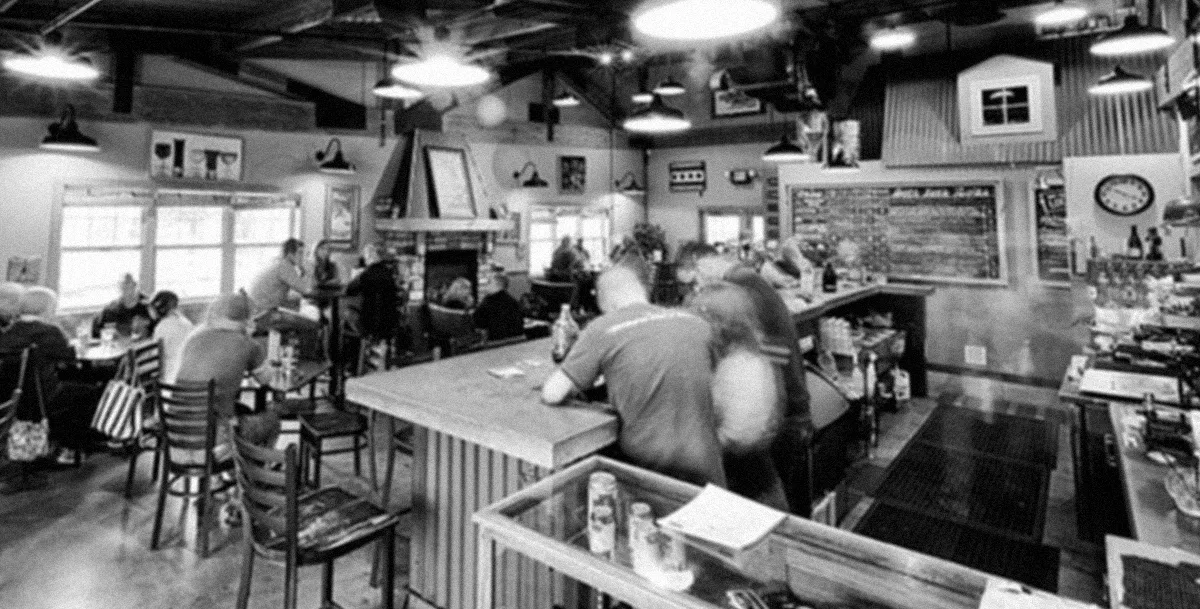
Pikes Peak Brewing built its early following in Monument, Colorado, where classic ales, a comfortable taproom, a patio and live music made the brewery part of the local community. After its first few years, the business was ready to package its beer and reach customers beyond the taproom.
Wholesale changed the context. On a crowded shelf, each can had to introduce the brewery, explain the beer and carry enough recognition to connect a new retail customer back to the place where the brand began.
What was happening
The Beer Was Ready For Distribution. The Brand Was Not.
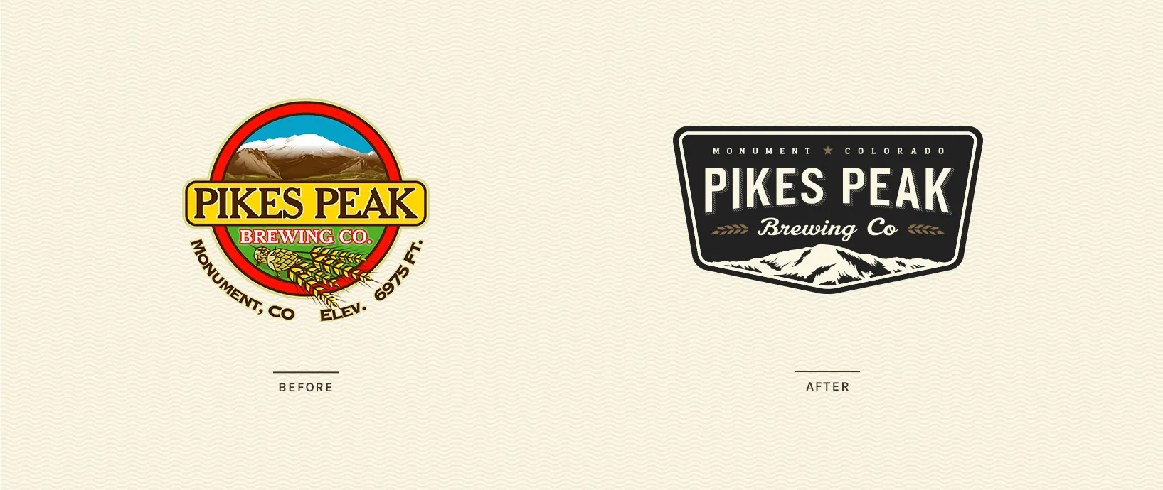
Pikes Peak’s existing logo carried too many colors and details to work effectively across cans, signs and small digital spaces. It also felt dated beside the quality of the beer and the brewery’s plans for growth.
The most obvious visual cue—the mountain—was also common among Colorado breweries. The challenge was to use the brewery’s location without disappearing into the same outdoor language as the rest of the category.
What we saw
The Mountain Was Only The Beginning.
Research across local landmarks and nearby breweries revealed a richer source of distinction. Pikes Peak’s beers were already named for regional places, monuments and events, giving the brand a story that could extend well beyond a generic mountain silhouette.
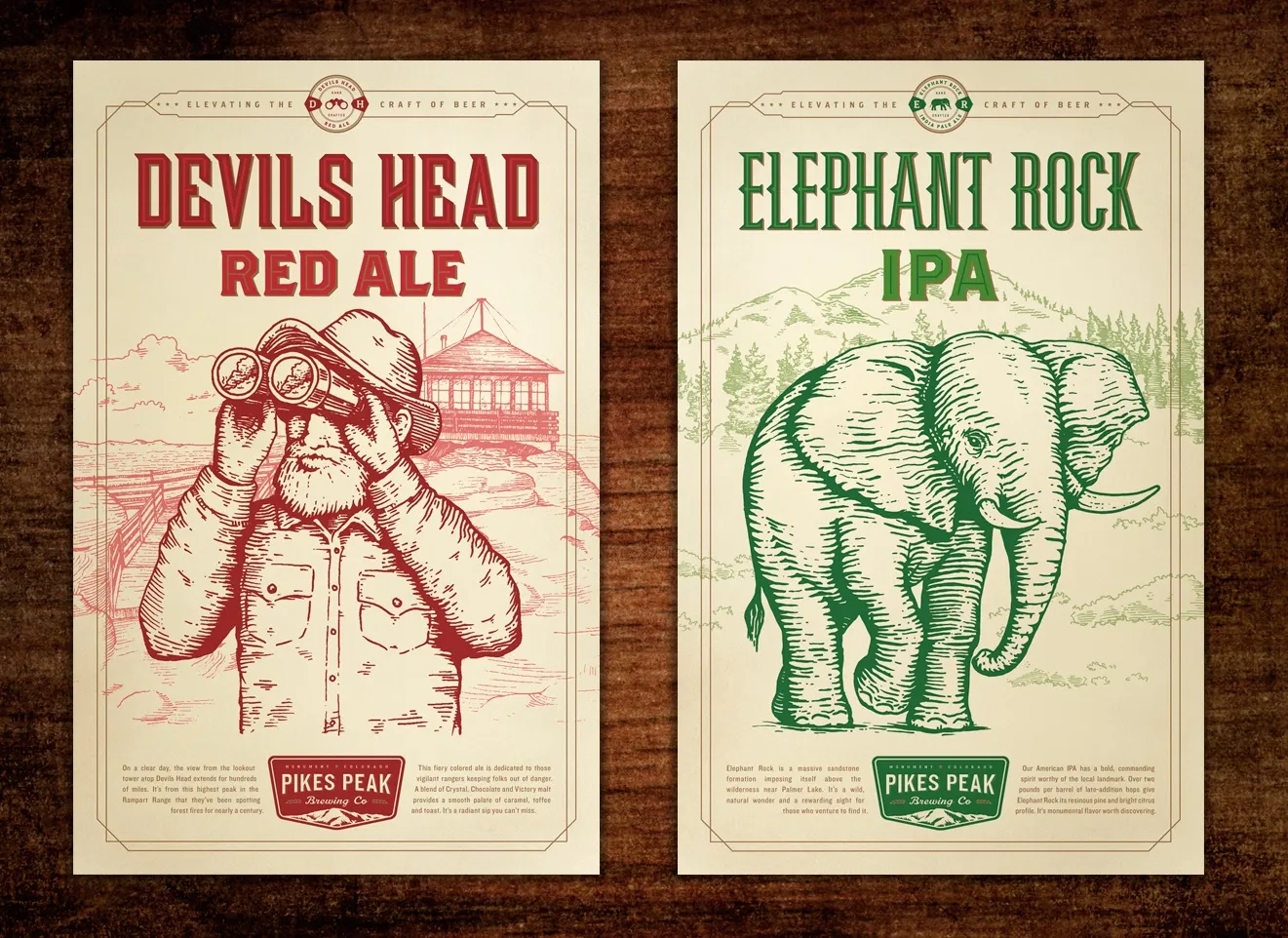
A vintage national-park language gave that story a useful structure. A ranger-badge mark created recognition for the brewery, while custom illustrations and bold color gave each beer its own piece of Colorado history.
What we changed
An Identity System Built Around Place.
01 / Market research and positioning
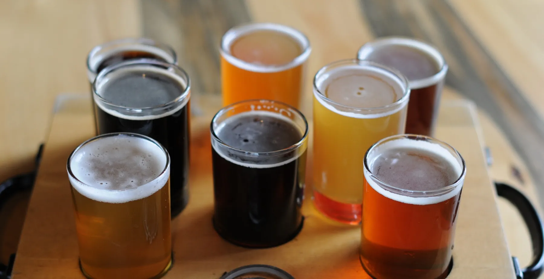
We toured Monument-area landmarks and craft breweries to understand the local story and the competitive shelf. That research established how place, history and distribution should shape the new brand.
02 / Brand identity
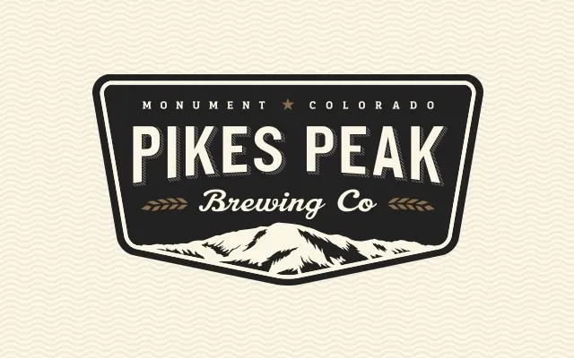
We simplified the brewery into a park-inspired badge with Pikes Peak at its center. Heritage typography, a restrained core palette and flexible lockups gave the identity enough character for large signs and enough clarity for cans and screens.
03 / Illustrated packaging
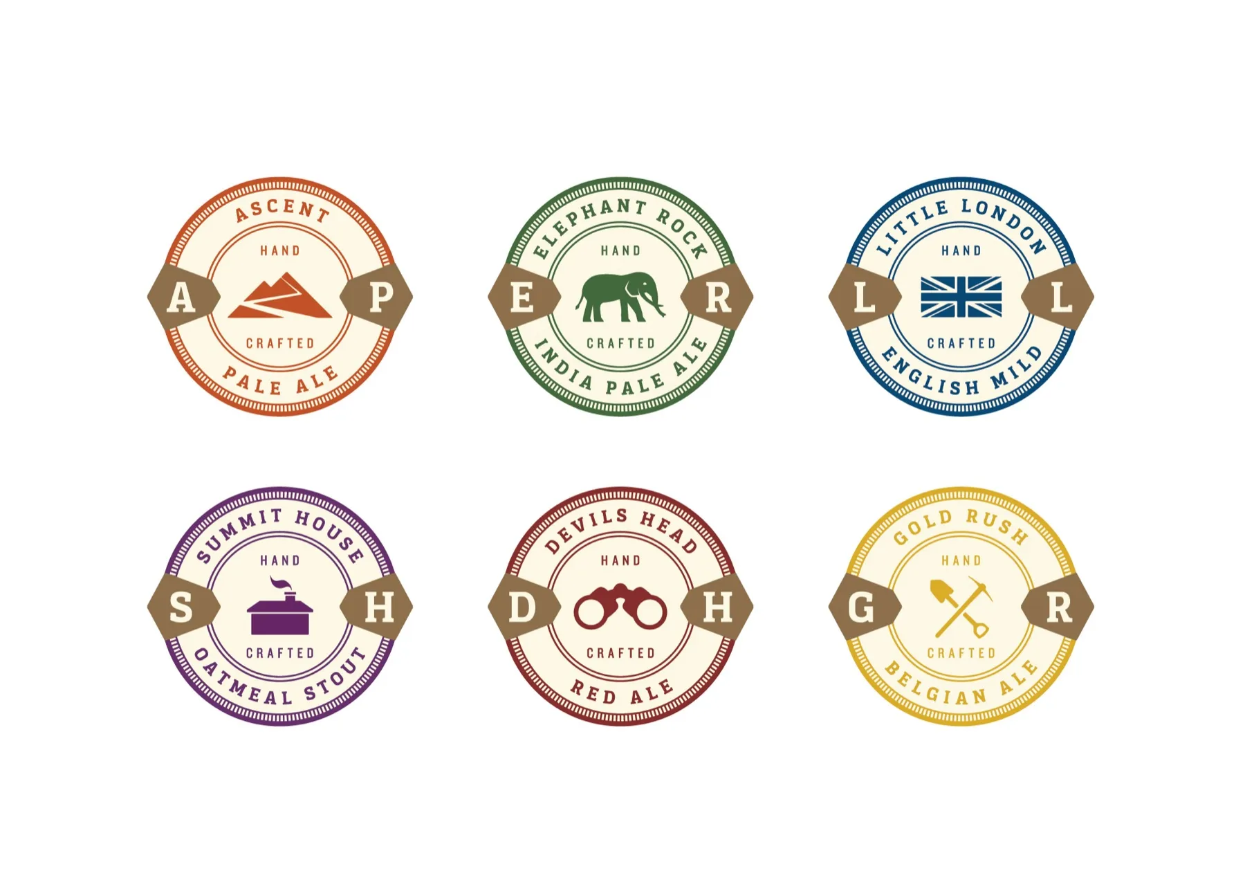
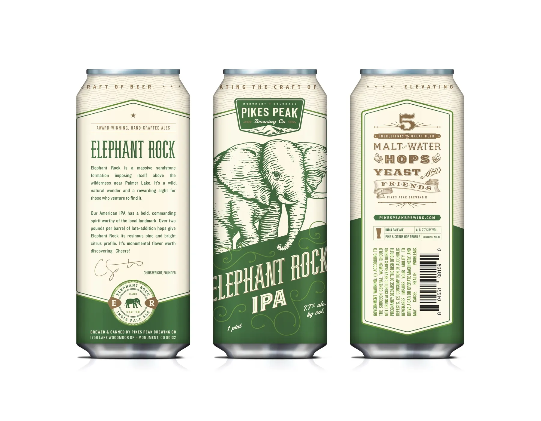
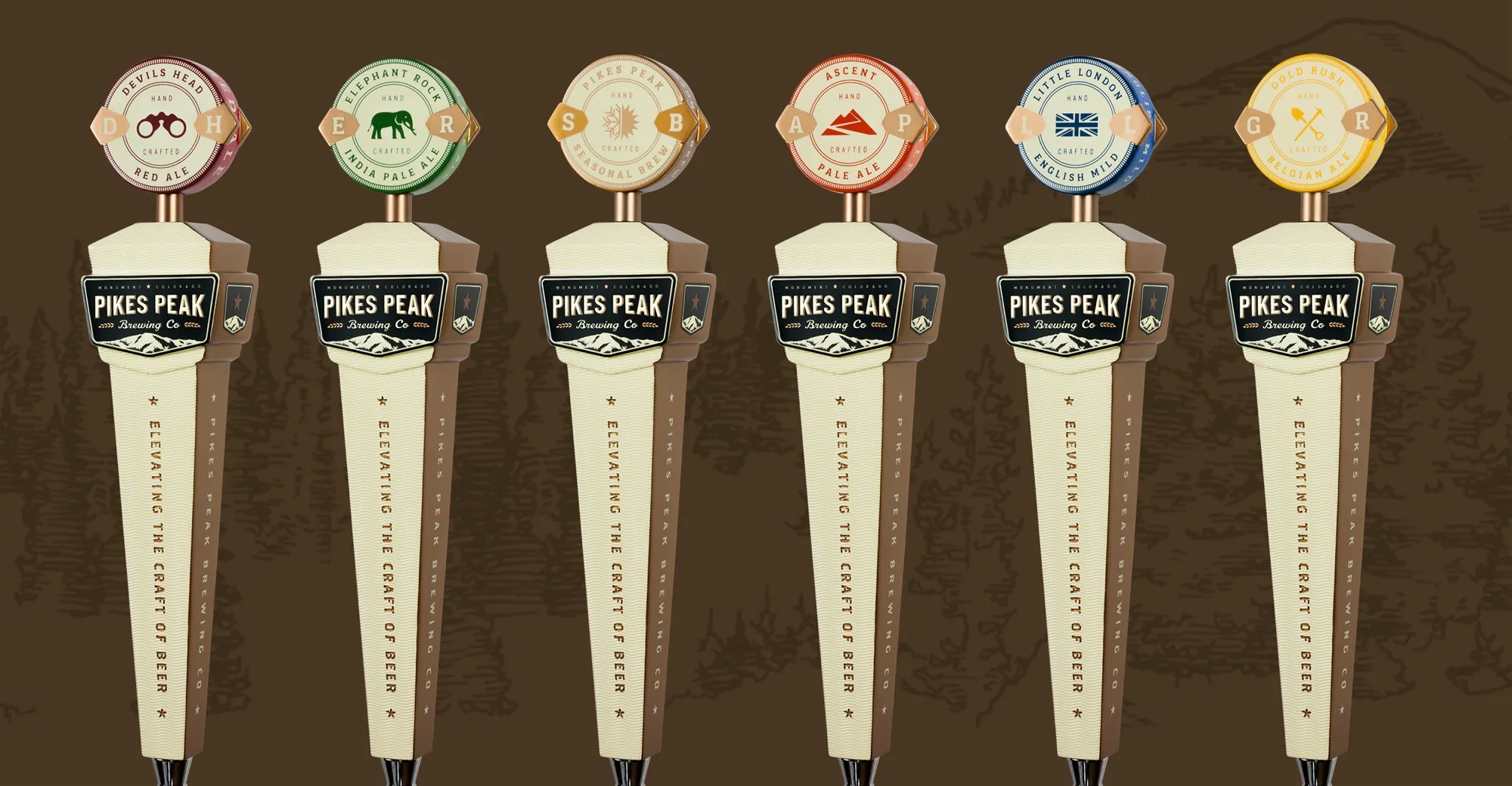
Six custom can designs connected individual beers to local landmarks and historical events. Strong color helped each variety stand apart while the badge, typography and illustration style held the assortment together.
04 / Launch campaign and digital
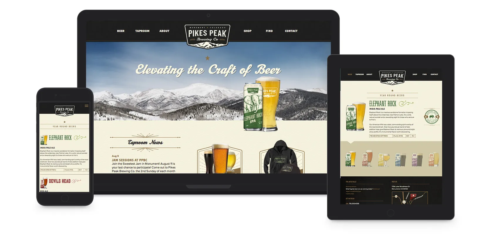
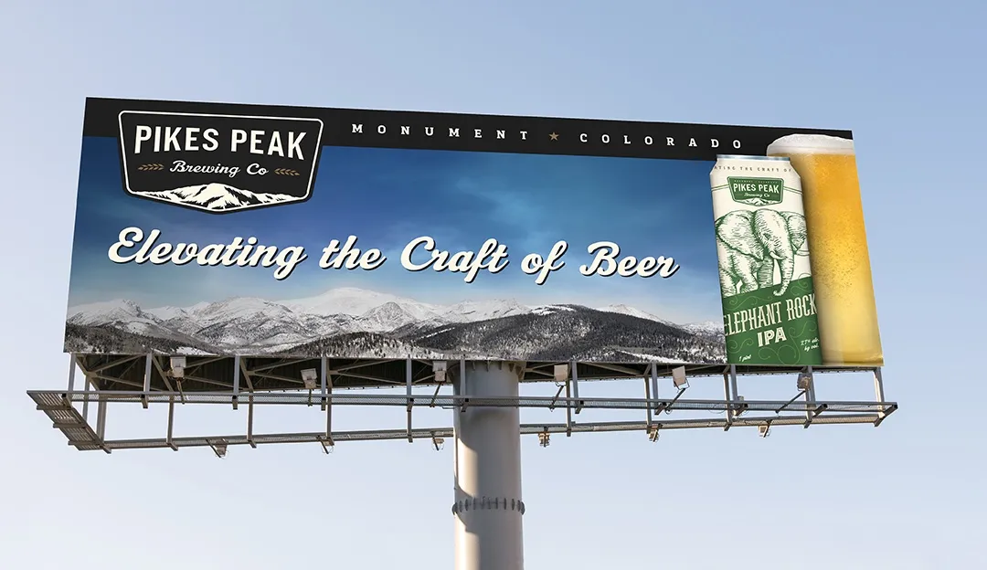
Tap handles, print ads, posters and billboards brought the identity into the market and taproom. A responsive website organized beer information, events, merchandise, ecommerce and local availability within the same visual system.
In the market and the taproom
How the pieces connected
Every Touchpoint Carried The Brewery Farther.
- Local history
- →Brand position
- →Park badge
- →Illustrated cans
- →Campaign + taproom
- →Wholesale discovery
Local research gave the identity a point of view. The badge made the brewery recognizable, illustrated cans brought that story to the shelf, and campaigns connected retail discovery back to the taproom. The website extended the same system into beer information, events, merchandise and local availability.
The impact
Growth Beyond The Taproom.
In the year after the new brand launched, Westwerk reported a 250% increase in wholesale sales, 37% growth in tasting-room sales and 60,000 cans produced. The work also received recognition from four design-award programs.
Wholesale growth
250%
Westwerk reported that wholesale sales increased 250% in the year after the new brand launched.
Tasting-room growth
37%
The same historical case study reported a 37% increase in tasting-room sales after launch.
Production scale
60,000 cans
Sixty thousand cans carried the new identity and custom illustration system into the brewery’s expanded market.
Creative recognition
Four award programs
The work was listed as recognized by AIGA Minnesota, Creativity International, Summit Creative Awards and HOW International Design Awards.
Those gains followed a broader expansion effort. The new system gave that effort a consistent public face across wholesale shelves, the taproom and digital channels.
Explore More Impact Stories

Build a more profitable restaurant.
Give Growth A Brand That Can Travel.
Moving from taproom sales into wholesale changes where and how a brewery competes. A clear identity, disciplined packaging and a connected launch system help a local favorite earn recognition beyond its home market.
Let’s Talk Growth